4.43 / 5 ⭐️
The Design System allows designers to build screens faster in their daily work.

Y


How a Design System became an internal product for designers, platforms, and territories.
Cinépolis is the largest cinema chain in Mexico and one of the most relevant entertainment companies in Latin America. Its digital ecosystem supports experiences across multiple countries, devices, platforms, and usage contexts.
Within that ecosystem, the internal Design System, called Eclipse, needed to help design and maintain public and internal products in a consistent, scalable, and efficient way. Its scope included customer-facing digital channels, internal dashboards, and operational tools used by different teams across the organization.
This case focuses on the transformation of Eclipse 2.0, a second stage of the Design System led from the Design Governance area. Although Eclipse already had a first version, the system needed something deeper than a visual update or a component cleanup.
The first version had centralized part of the work, but it had not solved the main problem: Cinépolis needed a shared way to build digital products.
The challenge was not only to improve a Figma library. It was to turn the Design System into an internal product with users, research, documentation, support, measurement, releases, adoption, and an architecture capable of growing without repeating the same problems it was trying to solve.
Because having a centralized library can sound good. Until everyone realizes that centralizing disorder is still disorder, just with an official name.
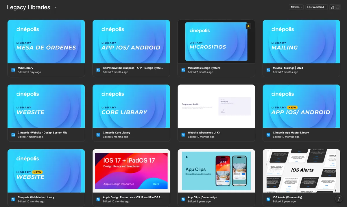
Before Eclipse, each designer or team could create their own libraries for their channel. Some were shared, others were not. Some solved real problems, while others simply duplicated decisions that already existed somewhere else. There was no single source of truth.
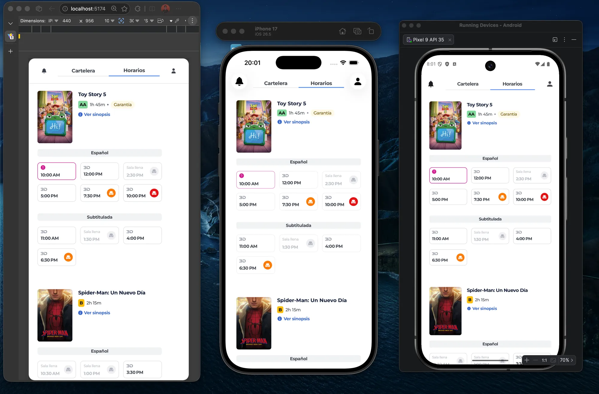
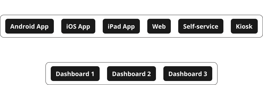
Eclipse 1.0 tried to solve that fragmentation, but its execution was not enough for the real scale of the ecosystem. The library mainly covered Android, iOS, and web, leaving other channels and products either uncovered or poorly supported, such as kiosks, self-service, dashboards, and internal tools.
In addition, the relationship between design and production was not consistent. There were differences between what existed in Figma and what ended up being implemented. Some color, spacing, and typography definitions did not match production. In some cases, colors were even created outside the system, which is a fairly creative way to use a Design System.
The problems were not only visual. There was also design debt, lack of documentation, components that were difficult to scale, unclear processes, and limited communication between Governance and the Experience Designers.
Within Cinépolis’ Digital Transformation Office, there was an Experience area. Inside it, Design Governance was responsible for the Design System. However, Governance was not yet operating as a team that actively guided how products were built. In many cases, it simply systematized decisions that had already been made elsewhere.
Eclipse 2.0 changed that logic.
The goal shifted from replicating existing components to building a working model for designing digital products in a more consistent, modular, and scalable way. More than a library, Eclipse needed to become an internal product for the people designing, maintaining, and scaling Cinépolis’ digital ecosystem.
Eclipse 2.0 created impact across adoption, coverage, system simplification, and ways of working.
These data points do not only show that Eclipse 2.0 was used more. They show that the system expanded its coverage, reduced structural complexity, and started being measured as an internal product.
The objectives of Eclipse 2.0 were:
Before rebuilding Eclipse, we needed to understand how it was actually being used.
The first step was to research the main users of the Design System: the Experience Designers. To do this, we conducted surveys and one-on-one interviews with 8 designers and 2 directors from the Experience area.
The research aimed to understand three things:
We also wanted to understand leadership expectations: what they considered success, what they expected from the Design System, and how they saw its role within the Experience area.
The findings showed that designers did use Eclipse, but they had learned to work around its problems. When something did not work, they often did not report it. They looked for references in previous files, manually adjusted components, or created their own solutions.
The problem was not lack of adoption. It was fragile adoption.
Some of the main pain points were:
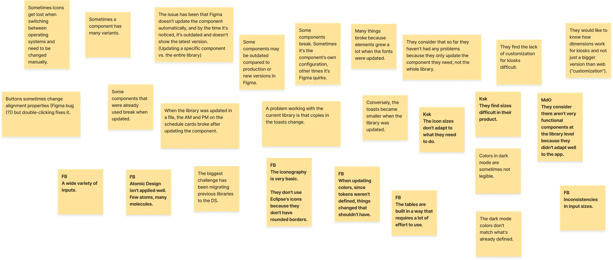
One of the most important findings was that Kiosk was the product with the most problems using the current library. This showed that Eclipse 1.0 was not prepared for all of Cinépolis’ real contexts.
The research also confirmed that designers had Design System culture. They used the library whenever they could and avoided going outside it. But the system did not always provide the tools, coverage, or documentation they needed to do it well.
Based on these findings, Governance defined three strategic questions:
After the research, we audited Eclipse 1.0 and its relationship with production.
The audit reviewed:
Unlike the first version, this audit considered all channels that existed at the time:
Dashboards were at a different stage. Some had started from a public library that was adapted internally, which created design debt. With Eclipse 2.0, they gradually began integrating shared foundations and specific components according to their category.
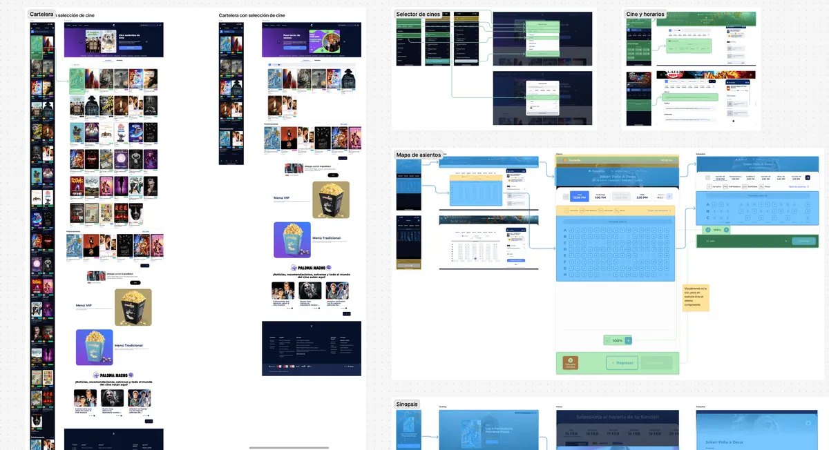
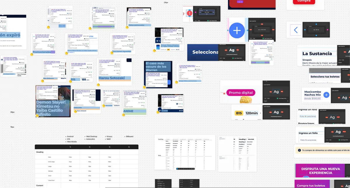
The audit confirmed that Eclipse 1.0 was centralized, but not truly scalable.
Everything lived in a single file. This made the library heavy and forced products with different needs to load assets, components, or elements they did not need. Centralization existed, but it did not necessarily solve complexity.
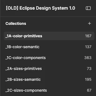
The system also had an overly fragmented token architecture. In Eclipse 1.0, there were multiple coections for color, sizes, strings, regionalisms, and languages. Across the visible layers alone, there were 1,207 tokens, distributed between primitive, semantic, and component tokens.
The problem was not that tokens were missing. The problem was that there were too many decisions without enough clarity of use.
Before rebuilding the library, we defined the principles that would guide Eclipse 2.0:
Simplicity
The system needed to be simple to use and simple to build. Designers should not have to decode complex structures to choose a token, use a component, or adapt a screen.
Accessibility
Accessibility was not optional. It was one of the system’s pillars. Color, contrast, states, sizes, and interaction decisions needed to consider accessibility from the foundation.
Scalability
Every decision had to be analyzed through its future impact. A component should not only solve the current case, but also avoid becoming the problem of the next version.
Documentation
Everything released in the library had to be documented. At minimum, each component needed to explain what it was, how to use it, its variants, properties, specific cases, best practices, bad practices, and relevant changes.
Composable
The system needed to be built with pieces that could be combined and adapted to different products, channels, and contexts without creating isolated solutions for every case. The intention was not to design rigid components for unique scenarios, but a flexible foundation that could support different experiences through the same shared logic.
This principle connected directly with Atomic Design and the modular architecture of the system. Atomic Design helped organize pieces from smaller elements to more complex structures. The modular architecture defined where each decision should live: universal foundations, libraries by product type, or specific libraries for truly particular cases.
There was also an unwritten but fundamental principle: thinking about development from Figma. Properties, variants, and structures should not only work visually, they also needed to consider how they could eventually be integrated into code.
The intention was not to rebuild everything for the sake of it. The intention was to define rules before building again, because building quickly without rules had already shown some very generous consequences for design debt.
One of the most important changes in Eclipse 2.0 was its architecture.
Instead of keeping everything in a single file, we defined a modular structure by levels.
Level 0 or Level 1: global libraries
This level contained the libraries that all Cinépolis products needed to consume, regardless of operating system, device, purpose, or whether they were internal or public products.
This level included:
However, all of them were managed through the same equivalence logic, to prevent a designer from choosing an icon that did not exist in other channels.
Patterns included both cross-product components, such as alerts, toasts, notifications, or modals, and documentation about usage rules. For example, how to manage user messages according to their level of intrusiveness and when to use each communication type.
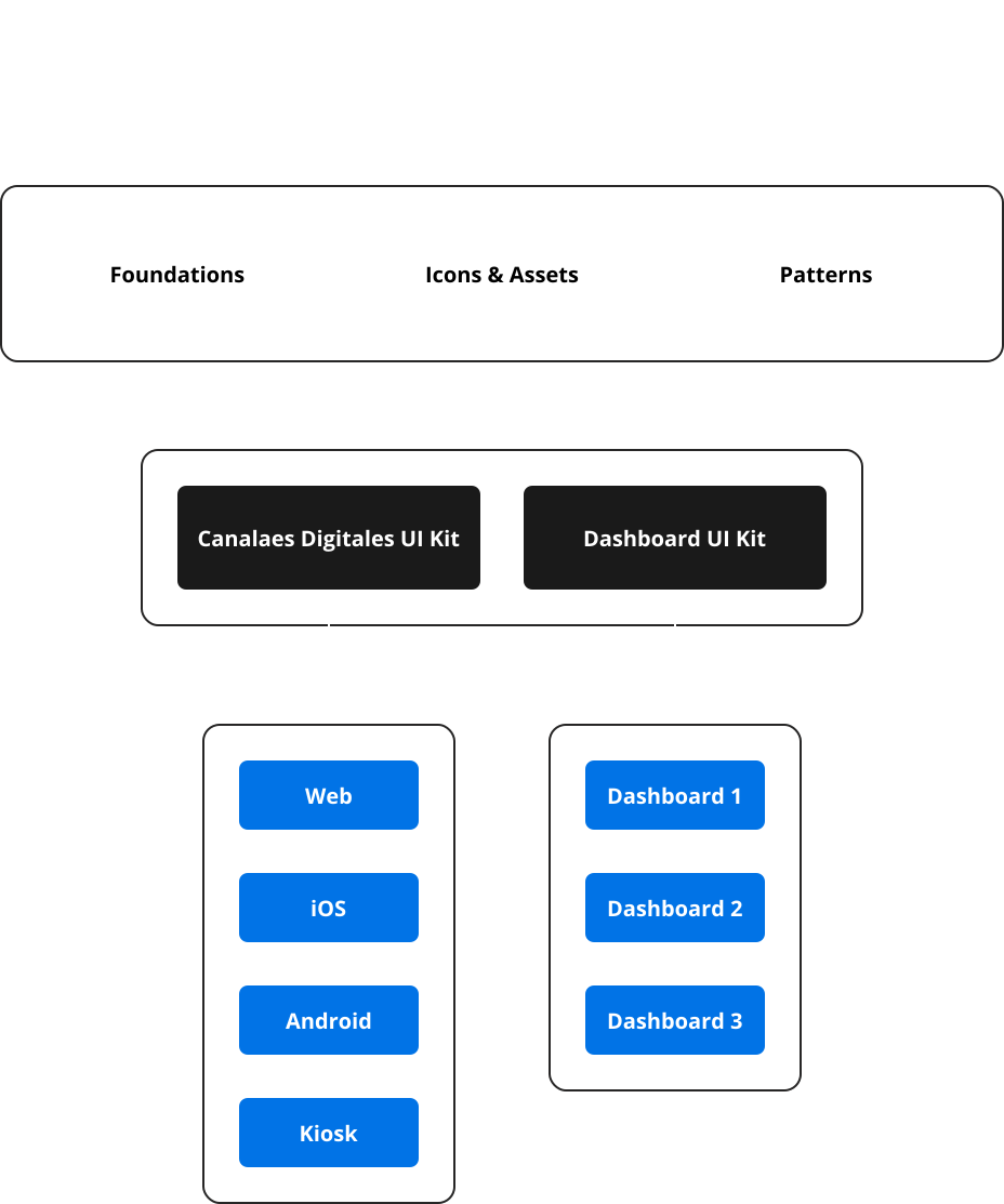
Level 2: libraries by product type
This level grouped components according to the nature of each product.
It included:
Digital channels were customer-facing products used for sales and customer experience across different countries and devices. Dashboards and internal tools had different needs, so they should not have to load the entire digital channels library.
Level 3: product-specific libraries
This level was used only for highly specific needs. For example, if a dashboard required specific organisms for tables, charts, or behaviors that did not apply to the rest of the dashboards.
Level 3 was not intended to multiply libraries without control. It was a controlled escape valve for solving specific cases without contaminating shared libraries.
The architecture responded to a key question:
How do we create a shared system without forcing every product to carry the entire system?
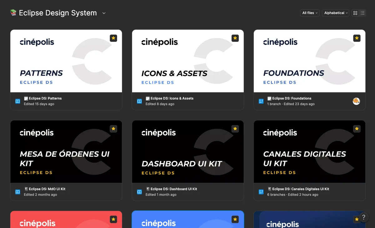
Eclipse 1.0 already had tokens, but its architecture was difficult to consume. There were too many collections, too many levels, and little clarity around when to use each token.
In Eclipse 2.0, we rebuilt the foundations from scratch.
The new architecture focused on four main collections:
We also removed the component-level token layer. In Eclipse 1.0, that layer generated a large number of specific definitions that made the system harder to maintain and understand.
The reduction was clear:
The solution was not to have fewer tokens just for the sake of having fewer tokens. It was about moving decisions to the right place.
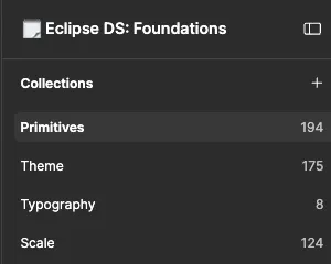
Color tokens
The new color anatomy was organized as:

This allowed a color to exist not only because it was part of the palette, but because it served a function within the product.
Color tokens were also refined in dark theme. This was especially important because Eclipse 1.0 approached dark theme too closely from the brand manual, instead of adapting the brand to how digital products actually behave across screens, components, and interaction states. In Eclipse 2.0, the goal was not to force the brand system into a dark interface, but to translate it into a token structure that could work naturally across both themes.
Typography tokens
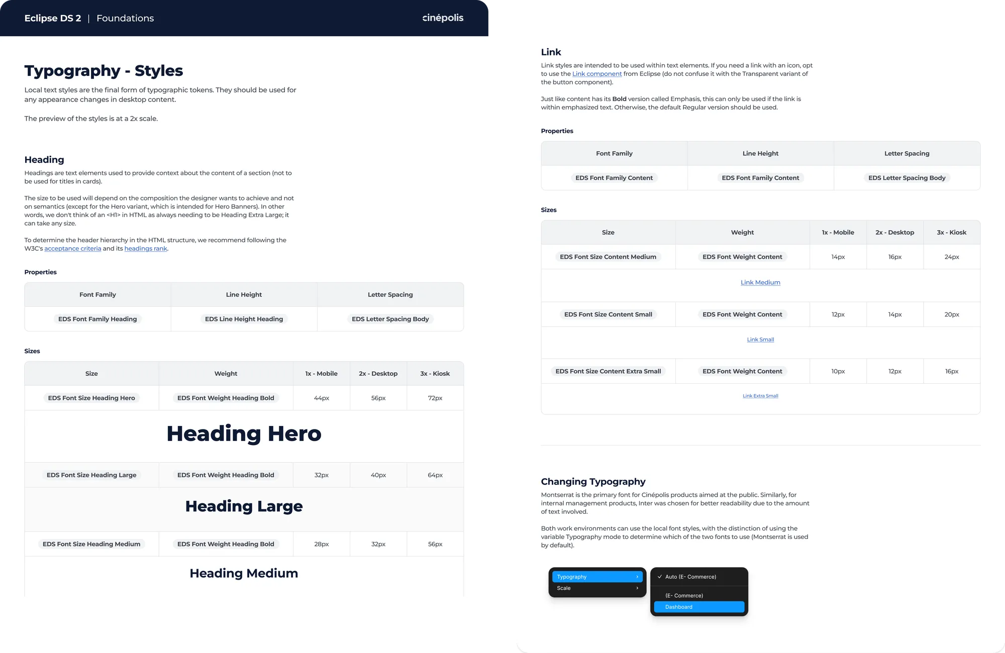
The typography collection had a key function: allowing different products to share the same typography system while changing specific values according to their context.
Digital channels used Montserrat to maintain a closer relationship with the brand. However, in internal dashboards, where users needed to analyze larger amounts of information, Montserrat was counterproductive for readability. For those cases, we decided to use Inter.
Instead of creating separate typography systems for each product, Eclipse 2.0 kept a single structure with the ability to switch between typefaces depending on the context. This allowed us to maintain consistency without sacrificing readability in denser products.
Scale tokens
The Scale collection allowed us to manage differences by context:
This structure helped solve one of the biggest problems in Eclipse 1.0: size differences across products and devices.
Eclipse 2.0 did not simplify the system by removing control. It simplified it by moving control to the right layer.
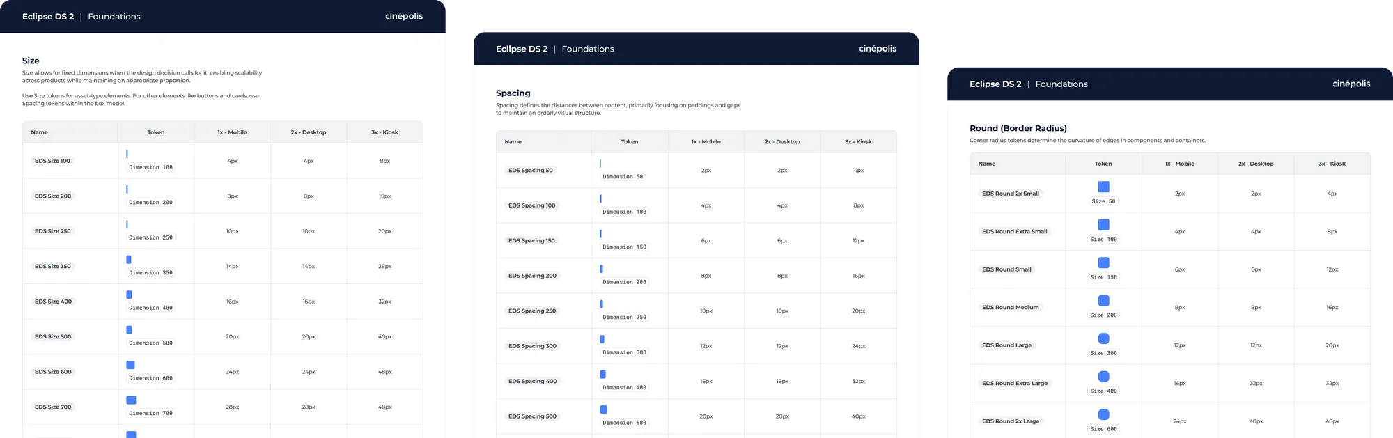
Eclipse 2.0 documentation was divided into two types.
Ways-of-working documentation
This lived in Confluence and was internal to the Governance team. It included principles, construction criteria, guidelines, internal processes, and rules for maintaining the system.
This documentation helped build culture within the Governance team.
Component documentation
This lived in Figma and was intended for Experience Designers.
Each component needed to include, at minimum:
Gallery - Documentation sections
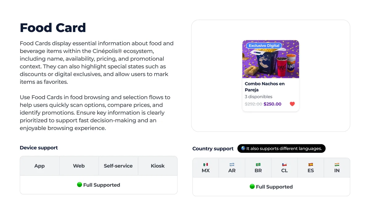
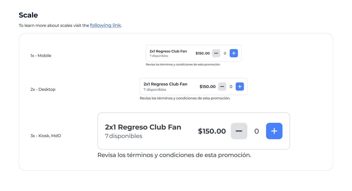
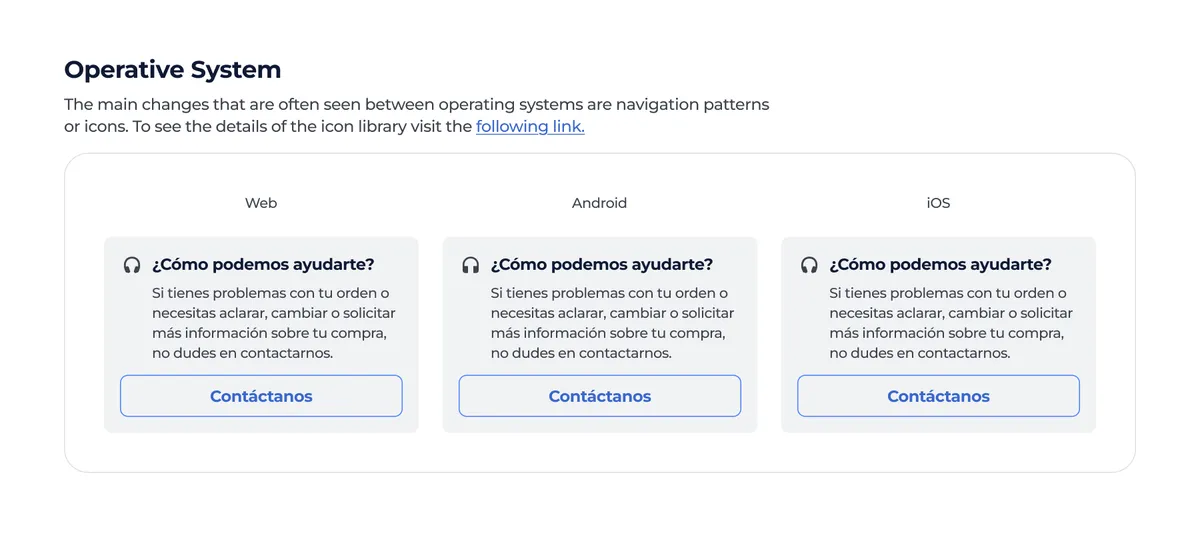
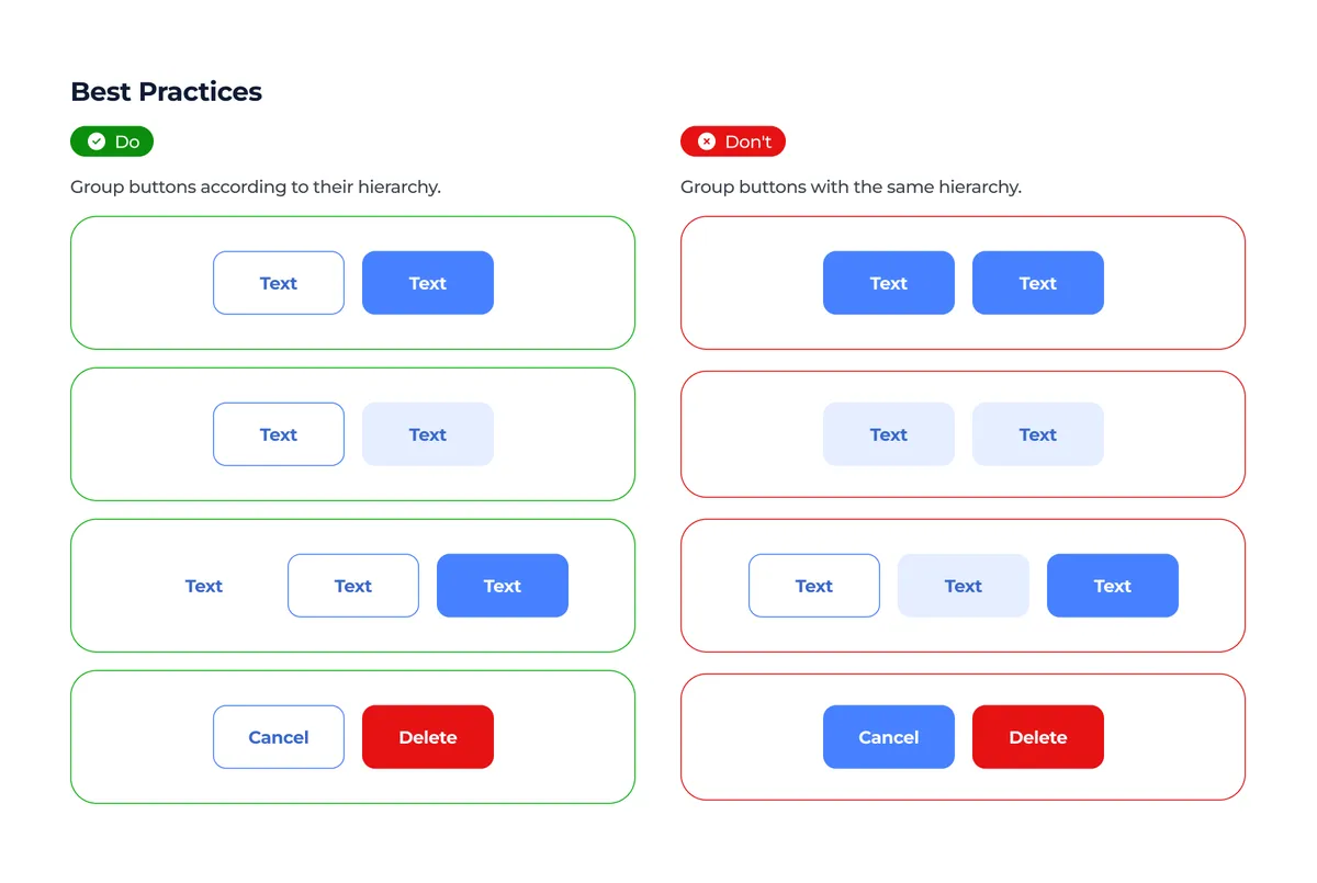
Channel support indicated whether a component could be used in app, web, self-service, or kiosk. This helped prevent designers from using components in channels where they had not yet been adapted.
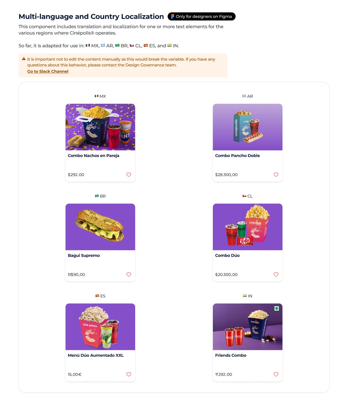
Country support considered Mexico, Argentina, Brazil, Chile, Spain, and India. It also included language and localization differences, such as Mexican Spanish, Argentinian Spanish, Portuguese for Brazil, and English for India.
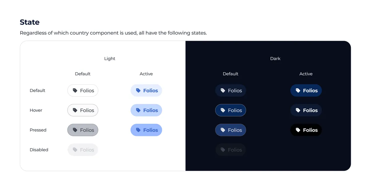
In Eclipse 2.0, documentation worked as a decision guide. It did not only show the component, it also indicated where it could be used, which countries it was available in, which languages it supported, how it responded to themes, scales, and operating systems, and what restrictions the designer needed to consider before applying it.
For Eclipse 2.0 to work as an internal product, publishing components was not enough. It also needed channels, processes, and rituals.
Previously, there were not enough clear mechanisms to communicate what lived inside the Design System, why something was added, when it changed, or how to request support. There was also no changelog to help understand the evolution of the library.
Eclipse 2.0 solved this by creating two main Slack channels.
Help channel
This channel was intended to resolve questions, request support, and discuss topics related to the Design System. Over time, it was also opened to roles outside design, such as business analysts, product owners, and developers.
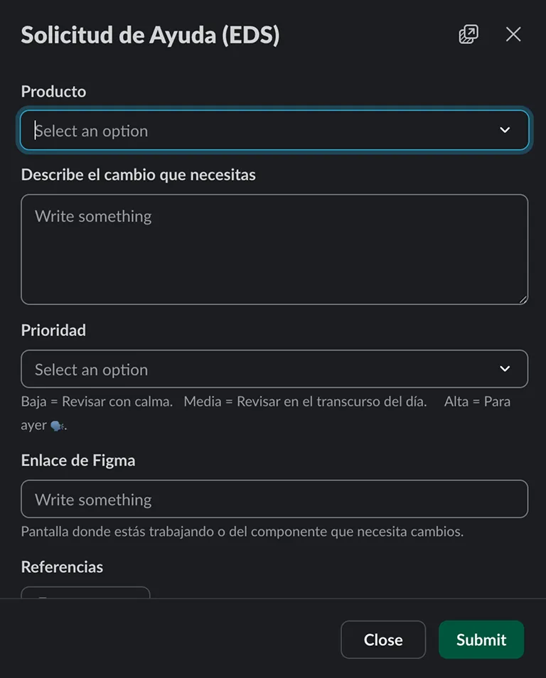
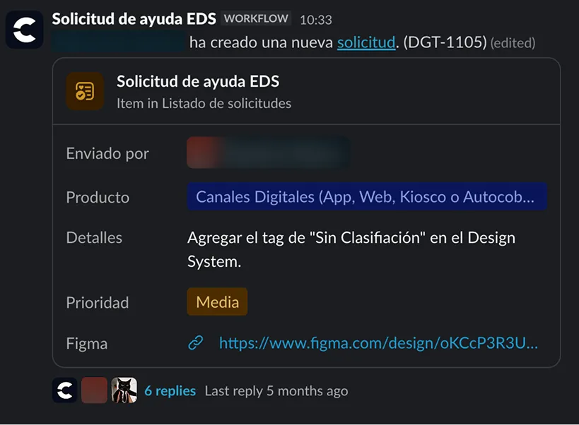
To avoid making requests dependent on manually tagging someone, we created a form inside Slack. A person could indicate:
Once submitted, the request was posted in the channel, tagged the Governance team, and created a Jira ticket. This allowed us to track work internally without turning the process into an invisible queue of lost messages.
Updates channel
This channel communicated Design System releases. Each release included what had been added, what had changed, and what designers needed to consider.
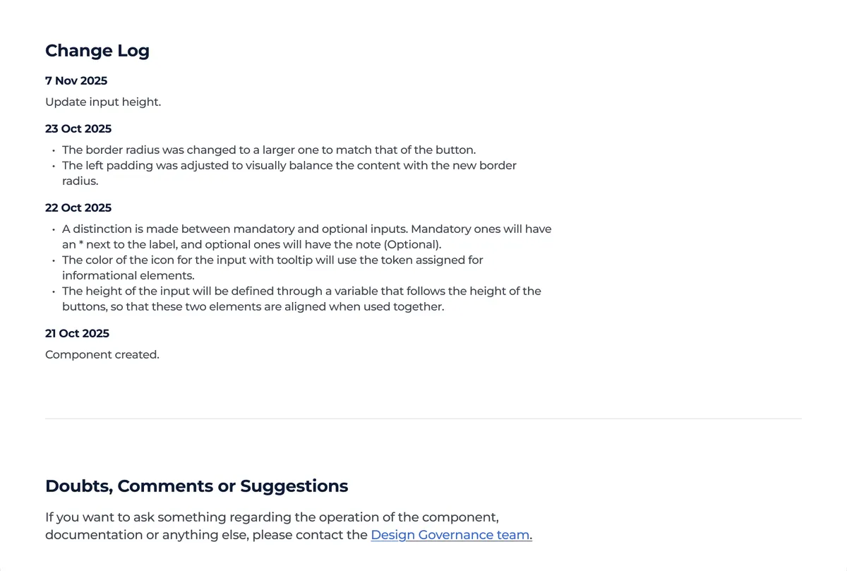
We also maintained version changelogs in Confluence and component-specific changelogs in Figma.
In addition, we ran quarterly surveys to evaluate how designers perceived the library, documentation, communication, and Governance support.
Governance also started acting more proactively. When an idea emerged to improve design operations through the Design System, we first consulted the Experience Designers. The goal was to validate whether the proposal made sense, whether it could affect their workflow, whether it was irrelevant, or whether it needed to be adjusted before reaching the library.
In this way, designers did not only receive changes. They also helped decide what should reach the system and what should not.
The cultural shift was one of the most important results. Designers started asking before executing, validating whether a component already existed, requesting changes, and proposing improvements. They stopped creating isolated components and began using the system as their main source.
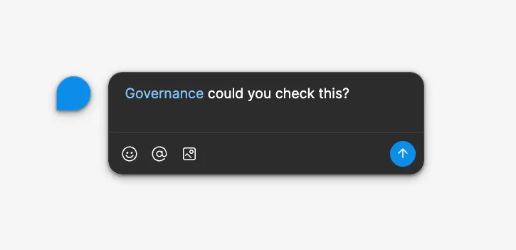
Governance also changed its role. It stopped being the team that systematized decisions made by others and started participating earlier in cross-area conversations. In some cases, Governance could reject decisions if they did not align with the system or if a more consistent alternative already existed.
Adoption was not assumed. It was measured. This is what designers said:
4.43 / 5 ⭐️
The Design System allows designers to build screens faster in their daily work.
4.86 / 5 ⭐️
Designers have the confidence to propose and/or request changes to the Governance team.
4.75 / 5 ⭐️
The documentation helps designers correctly apply components and tokens without slowing down their workflow
71% - Yes, as it should be!
Pineapple pizza? 🍕🍍
One of the most important results of Eclipse 2.0 was the structural reduction in how flows were designed.
Before, a critical flow such as ticket purchase could require up to 30 different versions because of the combination of countries, operating systems, platforms, and themes.
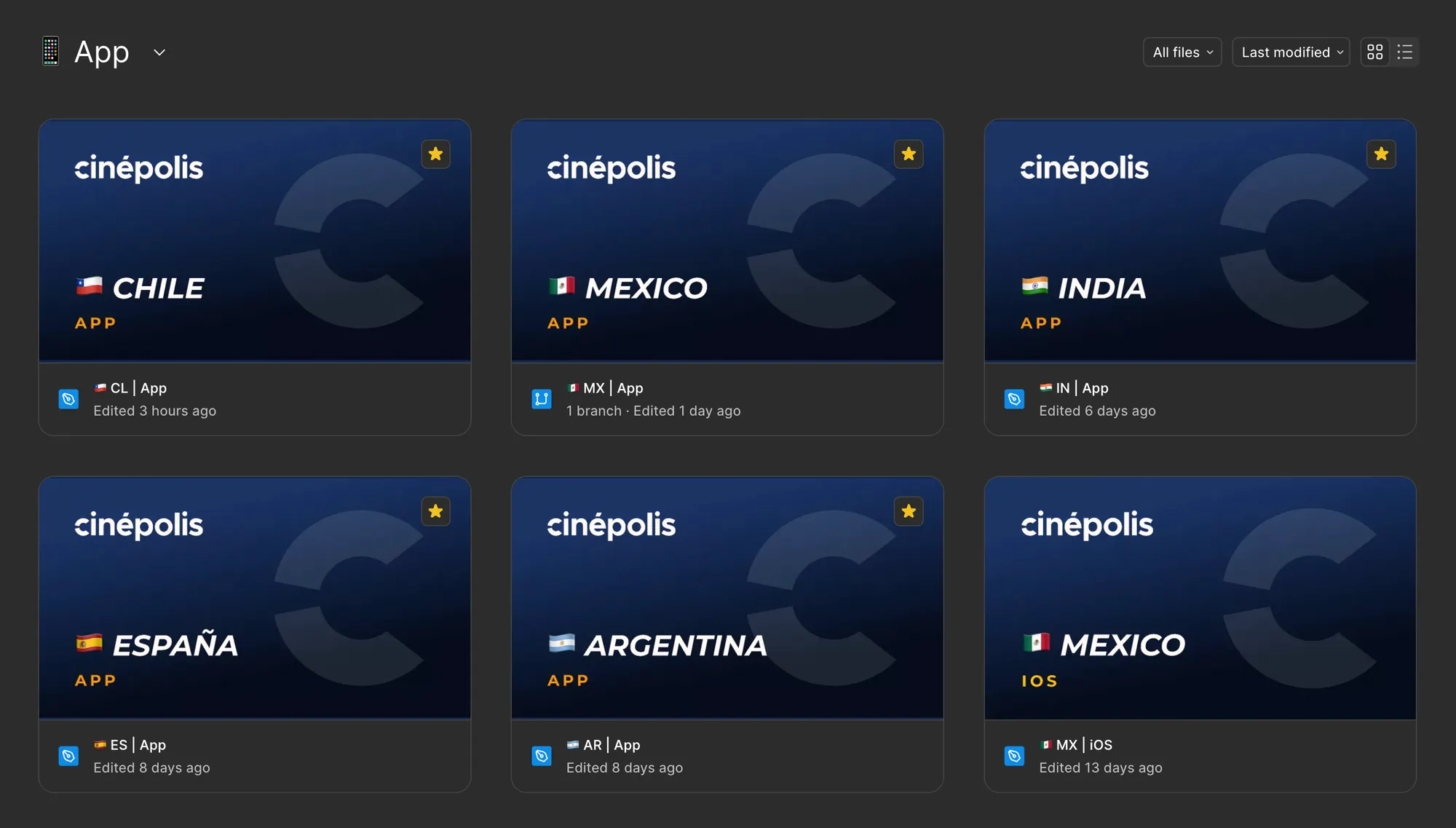
In practice, the same flow was repeated again and again to cover variations that did not necessarily need to be solved by duplicating screens.
The problem was not only the effort of maintaining so many versions. It was also the risk of human error. Some screens could fail to be updated. Others could keep components from previous libraries. Some could become outdated compared with the system. Localization errors, country differences, or theme inconsistencies could also appear.
When the same experience is replicated too many times, consistency starts depending on memory, manual care, and a bit of luck. A robust methodology, assuming the plan is to tempt chaos.
Another problem that was not seen until very late was the performance of these files. By having so many repeated flows it was very common for Figma to explode and not load the screens. Something very common and frustrating not only for design, but also for various areas that used files as a guide and documentation.
With Eclipse 2.0, those variations started living inside the system. Translations, localizations, themes, scales, and operating system differences were integrated into foundations, documentation, patterns, and variable modes.
The result was a structural change: instead of designing and maintaining up to 30 versions of the same flow, the team could design a single adaptable structure.
It was not only about saving time. It was about reducing duplication, preventing inconsistencies, and allowing the system to absorb the complexity that used to fall directly on each designer.
Eclipse 2.0 did not remove complexity. It moved it into the system, where it could be managed.
As part of the component review process, we instructed Claude using the area’s internal documentation and the Design System construction guidelines. With that foundation, Claude could support technical component reviews inside Figma, detecting deviations in naming, structure, properties, and construction criteria.
The results became actionable comments in Figma. Each comment included:
Claude accelerated inconsistency detection, but the decision remained human. The tool could identify deviations from the guidelines, but it did not always have the context needed to decide whether a solution should become a variant, a property, a new component, or a controlled exception.
The goal was not to automate design decisions. It was to automate part of the inconsistency detection process so Governance could focus on higher-value decisions.
Because reviewing layers one by one can be a formative experience. It can also be a very slow way to discover that a component broke the same five rules that were already documented.
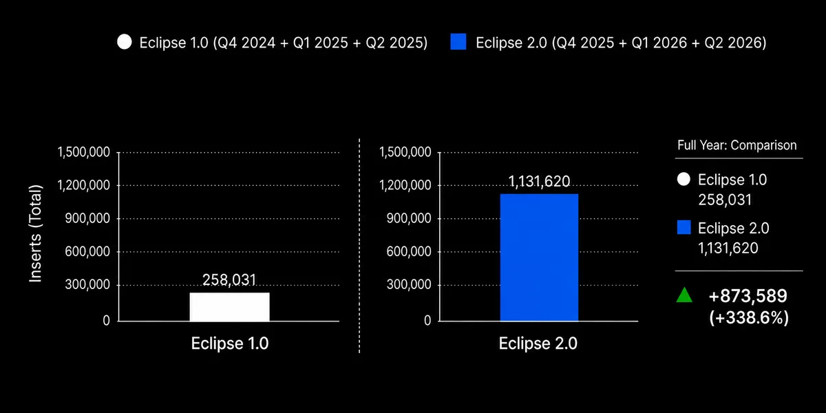
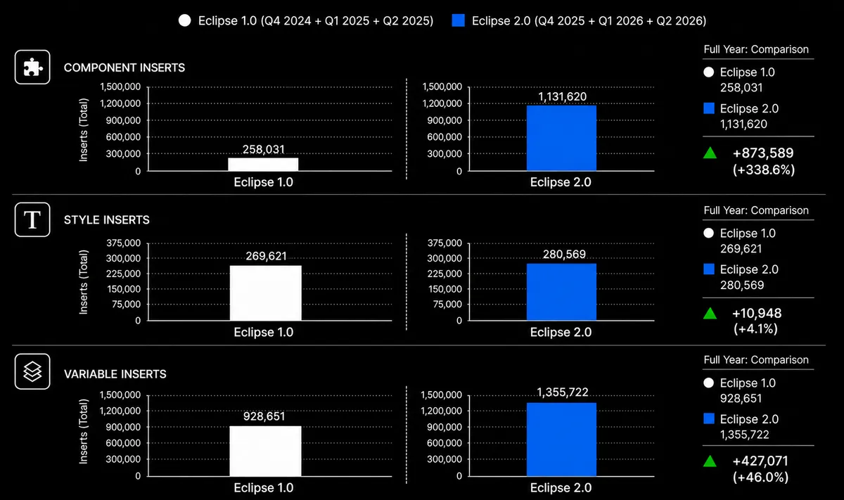
Eclipse 2.0 had significantly higher adoption compared with Eclipse 1.0.
Comparing equivalent lifecycle periods, component inserts grew from 258,031 to 1,131,620, representing a 338.6% increase.
This data was measured through Figma Analytics and shows actual system usage, not just usage intent.
There was also a 46.0% increase in variable inserts, indicating stronger adoption of the foundations and the new token architecture.
However, for this case, the main point is not simply that the system was used more. What matters is that it was used more after becoming clearer, better documented, more modular, and more oriented toward the real needs of its users.
Eclipse 2.0 also began to be measured as an internal product.
Quarterly surveys evaluated efficiency, flexibility, communication, collaboration, documentation, and trust in Governance.
The results showed positive signals:
Designeromments also reinforced the cultural shift:
The open communication channel and asking for our opinion or points for improvement as users helps us know how and what is being added to the DS.
It is quite accessible, in the sense that I can approach it and I know that whatever needs I have will be resolved.
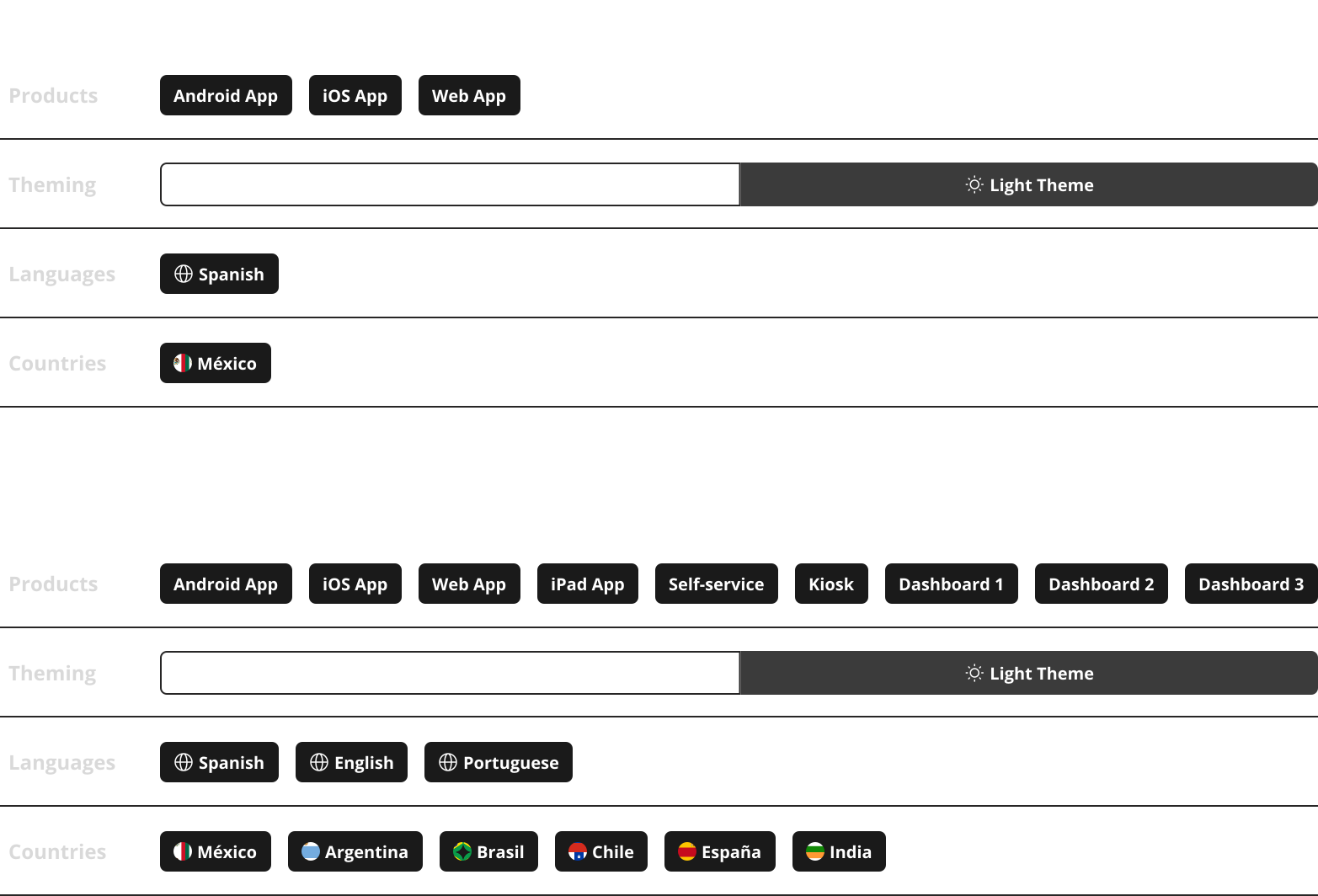
Eclipse 2.0 became the single source of truth for design within the covered ecosystem:
The project is still alive. This case does not represent a definitive closure, but the first year of Eclipse 2.0’s strategic transformation.
During that period, the system also absorbed new contexts that did not exist at the beginning of the transformation, such as iPad, Brazil, and Portuguese. Without the new architecture, integrating new channels, territories, and languages would have required much more manual work and probably new parallel solutions.
The result was not a finished system. It was a more mature way to keep building it.
Eclipse 2.0 has been the most important project of my career so far because of its scale, complexity, and the level of trust required to lead it.
The challenge was not only to design better components. It was also to convince the organization that a first version of the Design System, which had already taken a year of work, needed to be rethought from the foundation.
The decision was not small. Rebuilding a system means time, pressure, and a very reasonable question: why should we rebuild something that already exists? The answer was in the results.
Eclipse 2.0 transformed a library into an internal product. It created a modular architecture, reduced foundation complexity, expanded system coverage, improved documentation, opened support channels, measured adoption, and allowed Governance to participate more strategically in decision-making.
It also changed how Cinépolis could design digital flows. The same flow that previously could require up to 30 versions could now be designed as a single adaptable structure.
The main lesson was that a Design System is not only a visual collection of components. It can also be a tool for changing work processes.
When treated as a product, a Design System can improve communication, reduce duplication, document decisions, support scalability, and help teams work with more confidence.
Eclipse 2.0 did not just organize components.
It changed how Cinépolis could keep building digital products.
I know I referred to Eclipse as a design system all along, but we didn't talk about anything development. Don't worry, that's the fun part and will be covered in another case study.