


Introduction
Panzura is a B2B company focused on hybrid cloud data management solutions. One of its products is Panzura Data Services, a platform designed to provide visibility, monitoring, governance, and metadata intelligence for Panzura CloudFS through a unified dashboard.
The project started with a seemingly simple need: partially redesign the Panzura Data Services dashboard to make it clearer, more useful, and more relevant for its users.
However, during research, we discovered that the problem was not just visual.
The dashboard did not only need to look better. It needed to better understand who it was trying to help.
One dashboard. Five completely different priorities
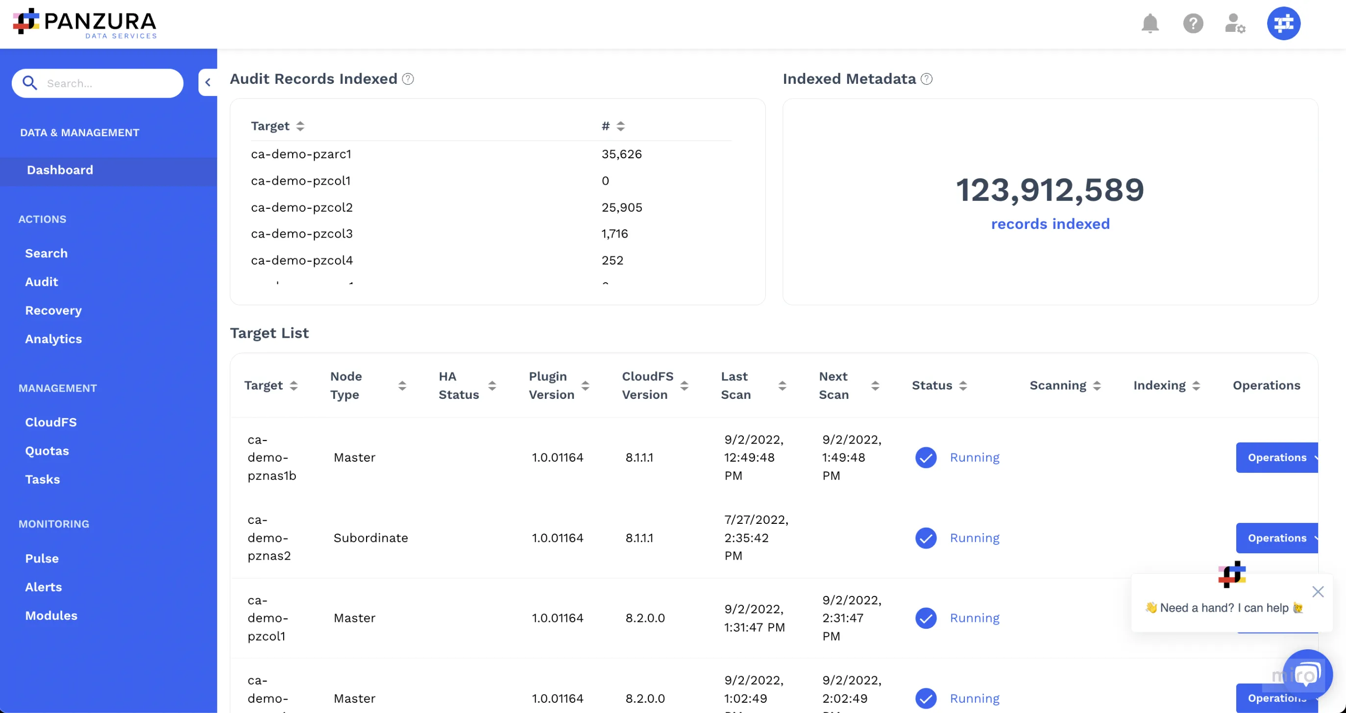
The original dashboard had been built mainly from a technical perspective. When users signed in, they saw a list of their organization’s targets and a counter with all indexed records. From there, they had to manually navigate through different modules to find the information they needed.
At first glance, the solution made sense. Everyone used the same product, so everyone received the same dashboard.
The small detail was that not everyone used the product for the same reason.
The client had never really questioned that initial structure. The dashboard had been built by developers, without user research, design involvement, or validation with the people who used it in their daily work.
Our initial hypothesis was that the information shown on the dashboard was not providing enough value. Not because the product lacked data, but because there was no clear prioritization based on each user’s role, tasks, and frequency of use.
In other words, the problem was not having a dashboard.
The problem was having one dashboard trying to respond to five completely different priorities.
Impact in numbers
Research helped transform a generic dashboard into a proposal based on roles, priorities, and real user tasks.
- 5 user types identified during research.
- 10 main widgets evaluated according to their relevance for each profile.
- 1 prioritization matrix created to define which information should appear in each role-based dashboard.
- 1 onboarding flow designed to allow users to select the role they identified with the most.
- 1 functional prototype used for user testing.
- 76 SUS usability score used as a secondary validation reference.
- 1 UI Kit created to build the new high-fidelity interface.
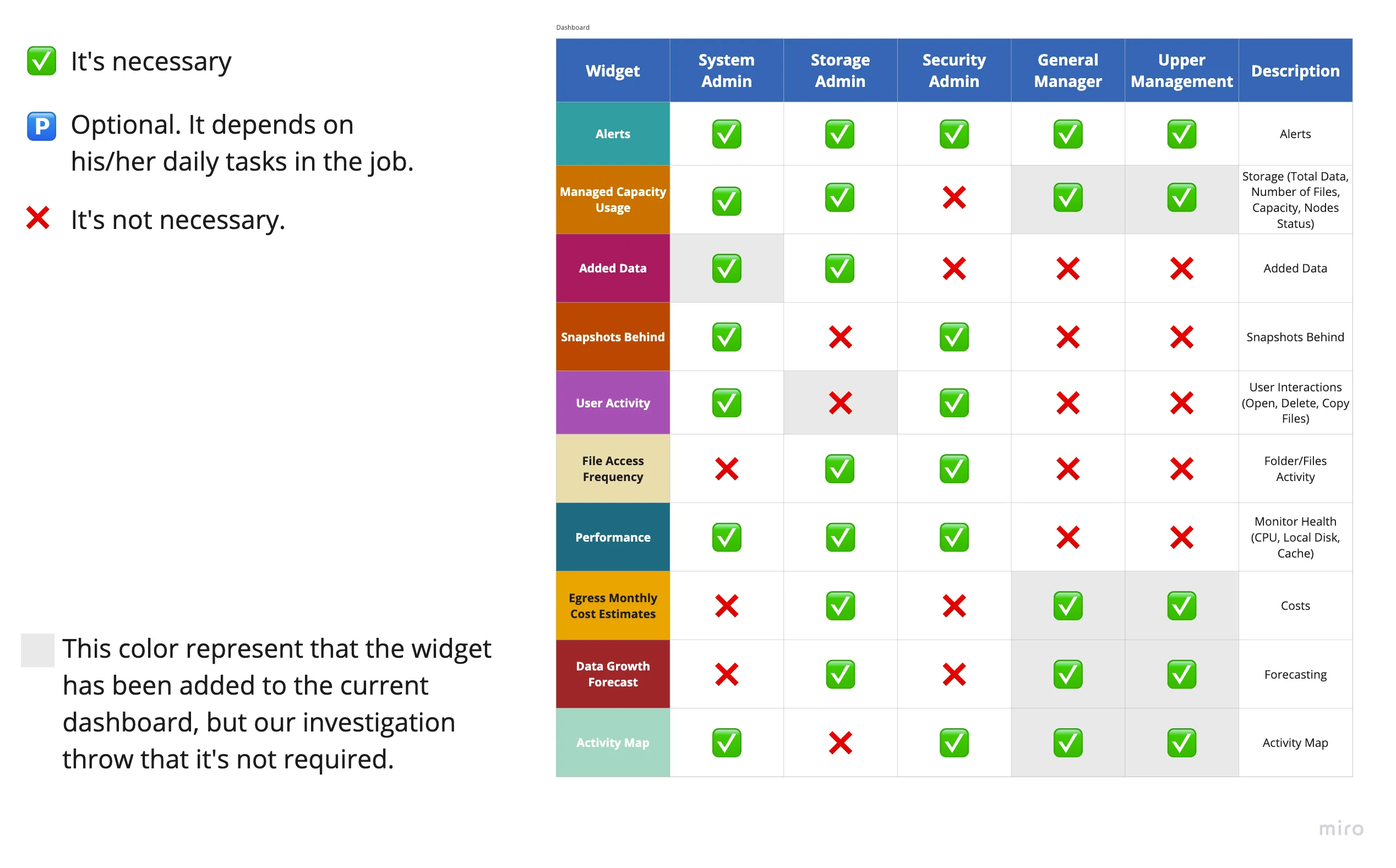
The widget matrix became one of the most important pieces of the project. It connected the main dashboard widgets with the different user types, identifying which information was truly necessary for each profile.
This analysis confirmed the central thesis of the case:
Users did not need five different products. They needed the same product to prioritize different information depending on the work each person had to perform.
Objectives
- Partially redesign the Panzura Data Services dashboard while respecting the existing visual guidelines.
- Identify the different user types and their main needs.
- Define which information should be prioritized for each profile within the dashboard.
- Validate a new experience through prototypes and user testing.
- Create a UI Kit and handoff documentation to support implementation.
From a generic dashboard to a role-based experience
Validating that there was not just one type of user
The first step was to understand how Panzura Data Services worked and how it was used inside an organization.
To do this, we conducted system walkthroughs, stakeholder interviews, and reviewed tickets related to the dashboard and its functionalities. This helped us better understand the product, reported issues, and internal expectations for the new experience.
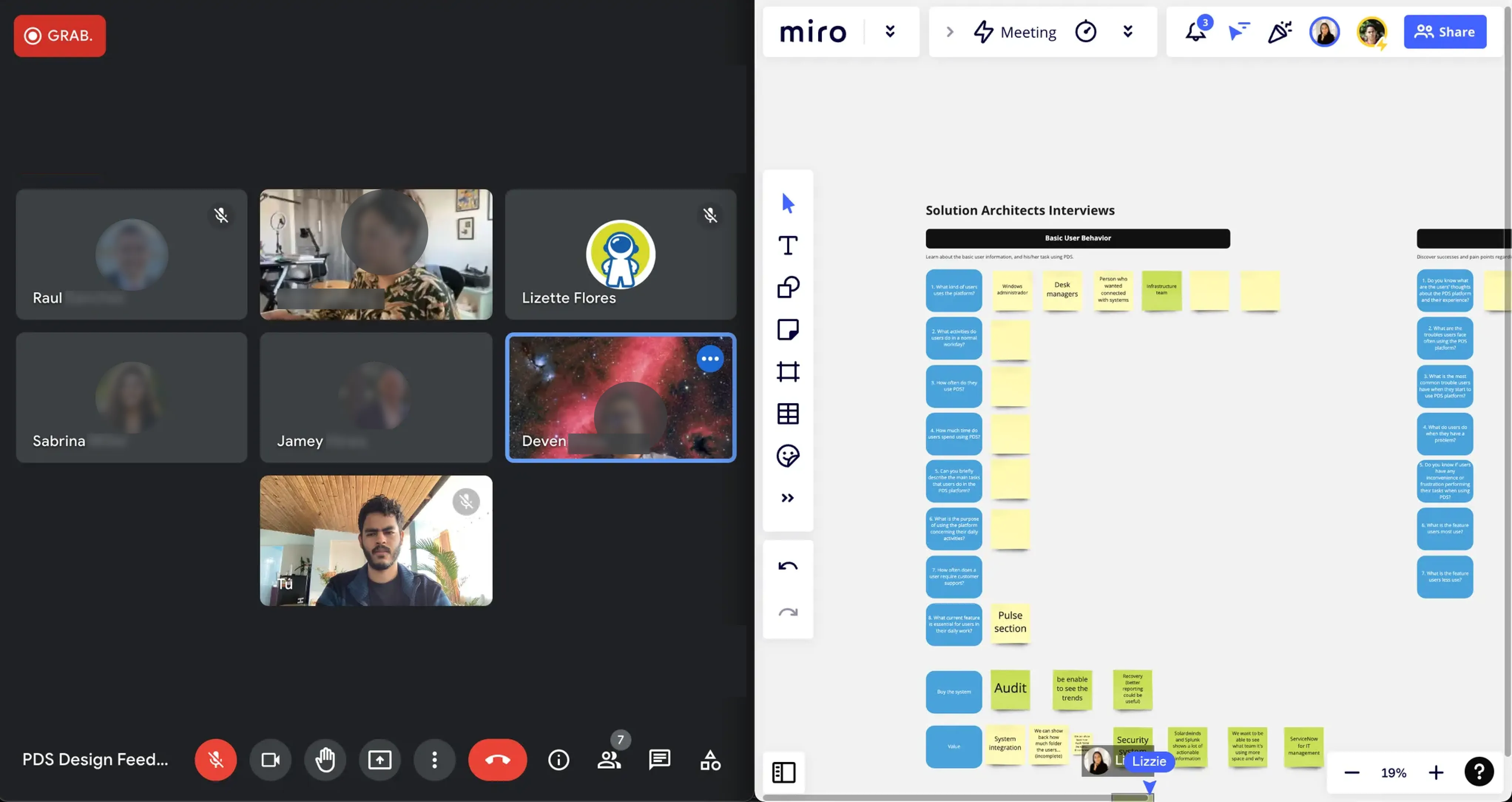
Until that point, the Panzura team mainly classified its users as System Admins. This simplification made the dashboard feel like a single experience for a general technical profile.
Research showed that this classification was not enough.
We identified five main profiles:
- System Admin
- Storage Admin
- Security Admin
- General Manager
- Upper Management
They all used the same platform, but they were not looking for the same thing when they signed in.
Some needed to monitor system health. Others needed to understand storage, costs, or data growth. Others were more focused on security, user activity, or file behavior. Executive profiles, on the other hand, needed a more summarized, strategic view focused on trends.
Grouping everyone under the same profile solved the problem in a table, but not in the product. Very convenient for documentation. Less convenient for design.
.webp)
The matrix that changed the direction of the dashboard
The most important research artifact was the widget matrix by user type.
Instead of assuming that every widget should have the same relevance for everyone, we mapped each dashboard widget against the five profiles identified during research.
The matrix helped distinguish which information was truly necessary for each profile and which information did not provide direct value for their daily tasks.
This analysis made something visible that had been hidden inside the interface:
There was no single combination of information that worked equally well for everyone.
For example, alerts were relevant for every profile, but other widgets, such as user activity, access frequency, data growth, performance, or cost estimates, changed significantly depending on the role.
The matrix became the turning point of the project because it transformed a subjective discussion about “what the dashboard should include” into a conversation based on roles, tasks, and priorities.
A fairly useful way to avoid the classic design method known as “put everything there and let the user survive.”
Prioritizing by role, not personalizing everything
Once the priority matrix was defined, the solution stopped being a visual redesign of the existing dashboard.
The initial proposal considered a fully customizable dashboard where each user could select, reorder, and configure widgets according to their own needs.
From an experience perspective, this made sense. If users had different priorities, allowing them to build their own dashboard seemed like the most flexible answer.
The problem was that it also introduced significant technical complexity.
After reviewing the proposal with the development team, we understood that full customization was not viable for the initial project scope. Implementing it would require more time, more configuration complexity, and a more flexible architecture than the team could support at that stage.
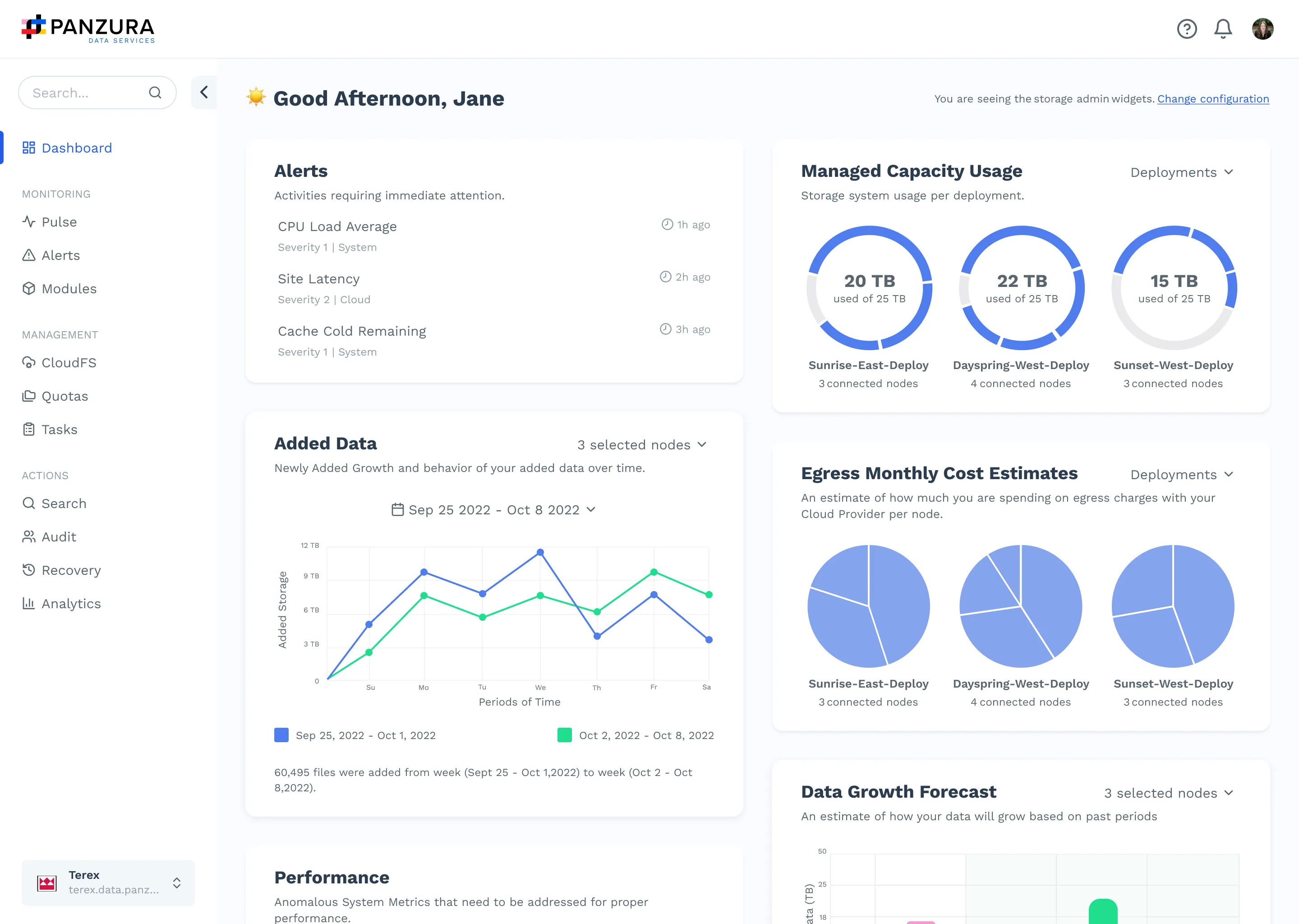
The solution was to negotiate a middle ground: designing five predefined dashboards, each aligned with one of the profiles identified during research.
This allowed us to preserve the core principle of the project, prioritizing information based on the user, without turning the first version into a full configuration platform. Because, apparently, “fully customizable” also means “more expensive, slower, and easier to break.” Who knew.
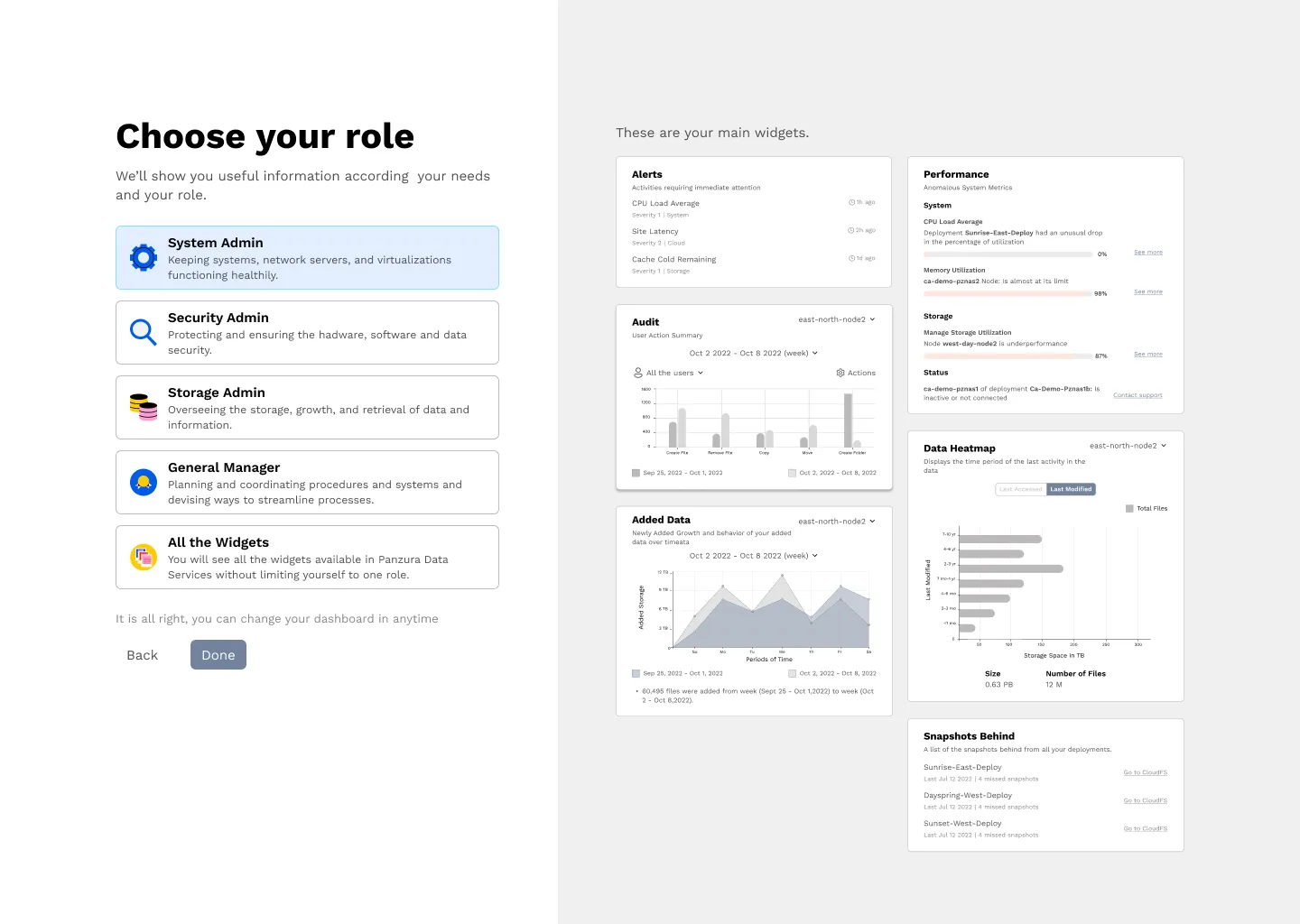
To support this, we proposed an onboarding flow where users could select the profile they identified with the most. This selection configured an initial dashboard with the widgets most relevant to their daily tasks.
Full customization remained planned as a second stage of the product.
Validating and building the final experience
With the profiles, matrix, and onboarding flow defined, we built a prototype to validate the proposal with users.
The test aimed to understand whether the new experience was clearer, more useful, and more relevant than the previous generic dashboard. During the sessions, users went through the onboarding flow, selected a role, and used the resulting dashboard to find relevant information.
The validation helped us observe how users understood the proposal, how quickly they could interpret the information, and whether role-based prioritization actually provided value.
As a secondary reference, we also used the SUS scale to evaluate usability. The prototype reached a 76 SUS usability score, which helped us identify adjustments before moving into high fidelity.
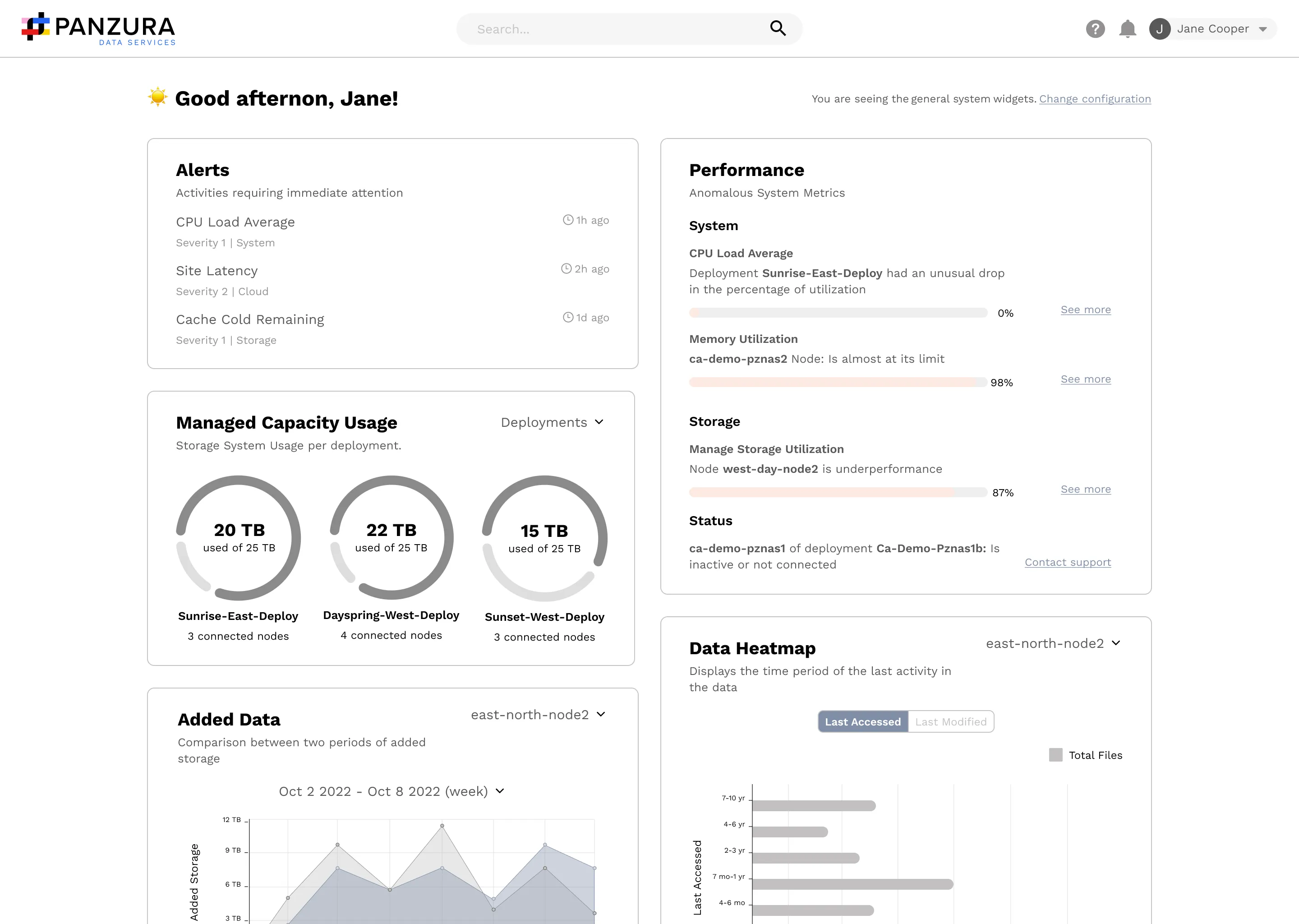
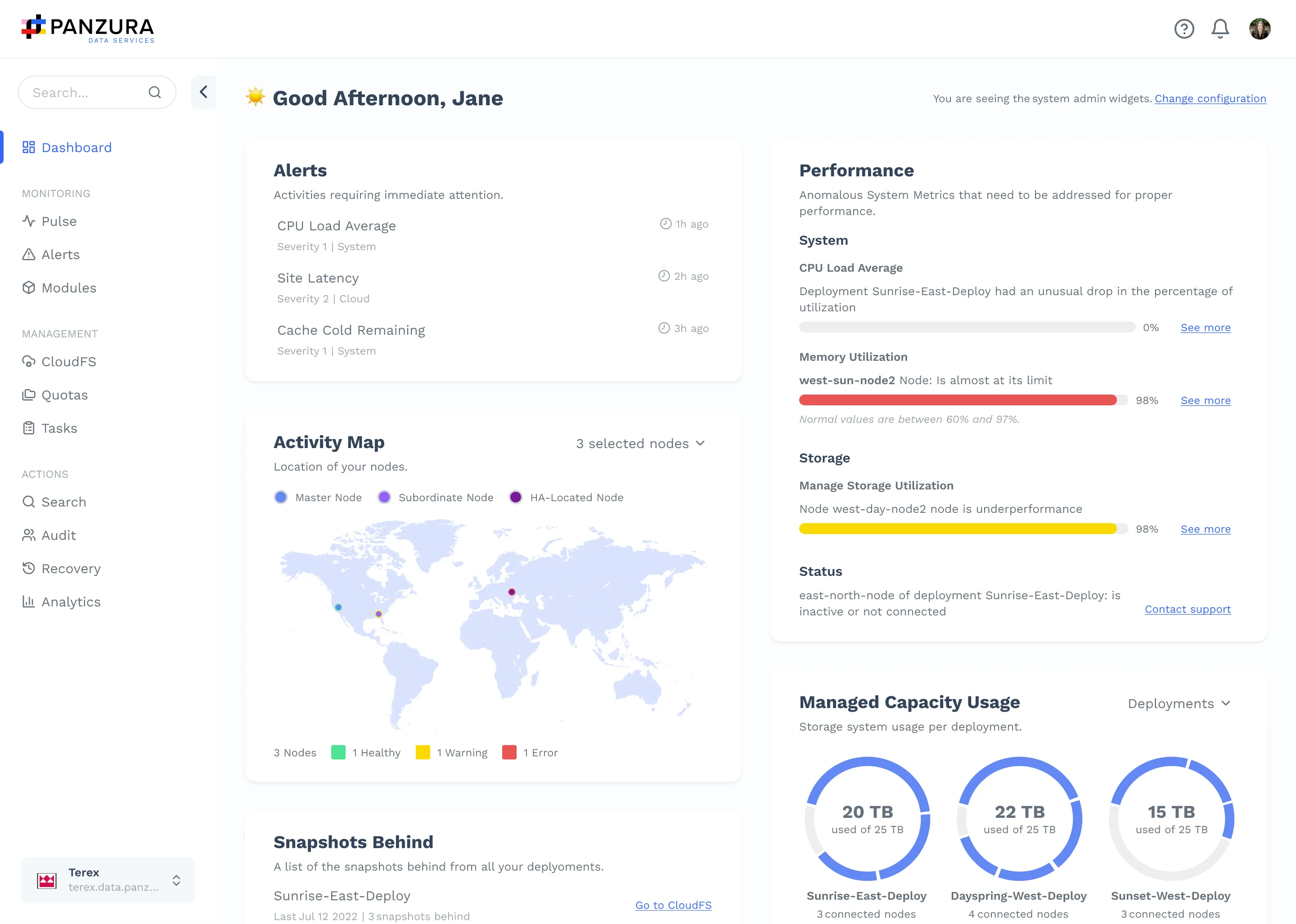
After testing, we iterated on the wireframes and built the final high-fidelity experience. The solution included role-based onboarding, predefined dashboards, prioritized widgets, and a clearer visual structure for scanning information.
The result was a dashboard that no longer tried to show “everything important” in the abstract, but what was important for someone in particular.
UI Kit and handoff
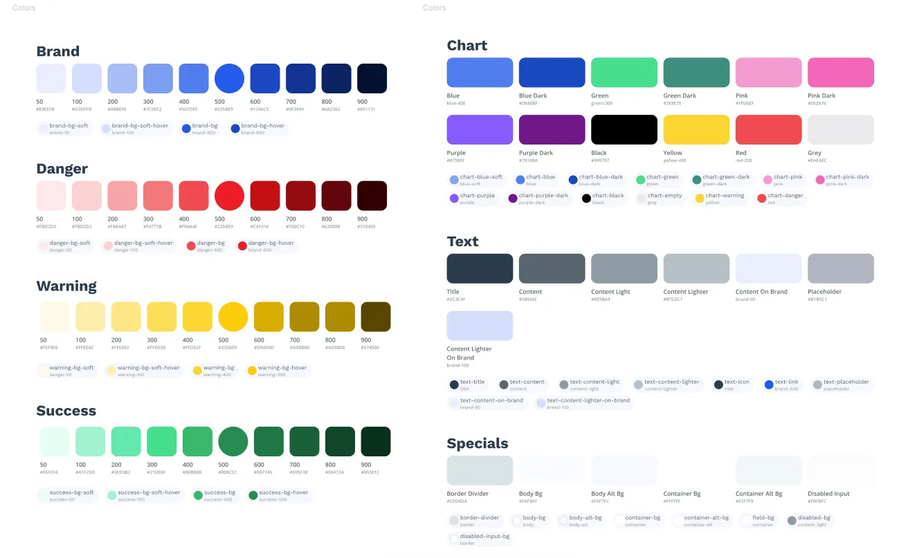
To build the final screens, we also created a UI Kit that worked as a visual and functional foundation for the new experience.
This UI Kit organized components, graphic patterns, interface elements, and usage documentation to maintain consistency across screens, widgets, and related flows.
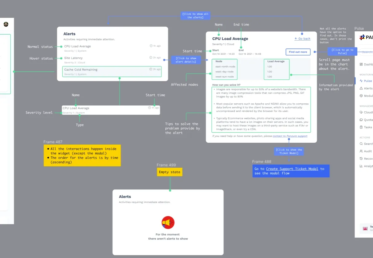
The project also included handoff documentation for development, including final screens, visual specifications, components, and flows needed to implement the new experience.
By the time I left the project, the proposal already included research, validation, high-fidelity design, a UI Kit, and development documentation.
I cannot confirm that the full product reached production because I changed jobs after this stage. What I can confirm is that the proposal was validated and prepared to move into implementation.
Results
From a generic dashboard to a validated role-based proposal
Before the redesign, every user entered the same dashboard, saw the same initial information, and had to manually navigate through the product to find what they actually needed.
After research and design, the final proposal allowed each user to select their profile during onboarding and access a predefined dashboard based on their priorities.
This did not mean creating separate products.
It meant recognizing that a System Admin, a Storage Admin, a Security Admin, a General Manager, and an Upper Management profile did not need to start from the same place.
The experience shifted from asking: What can the system show?
to asking: What does each user need to see first?
The prototype was validated with users and reached a 76 SUS usability score, used as a secondary reference to identify improvements before implementation.
One user summarized the value of the proposal clearly:
“The information provided by this new dashboard is potentially important to me because it answers the questions that are most difficult for me to answer today.”
In addition to the final screens, the project delivered a UI Kit and handoff documentation to support future design and development work.
The result was a validated, documented proposal prepared to move into implementation, although I cannot confirm its final release because I left the project after this stage.
A viable solution within technical scope
The initial full-customization proposal was reframed as a phased strategy.
The first stage focused on five predefined dashboards based on the profiles identified during research. This allowed the team to deliver value without depending on a complete customization architecture for the first release.
The second stage considered moving toward a more open customization model, where each user could modify their dashboard with more freedom.
That second stage was not completed during my involvement in the project, but splitting the solution into phases allowed us to preserve the core principle of the experience without breaking the technical scope.
Conclusion
The initial problem seemed to be a dashboard that needed visual improvement.
Research showed something more important: the dashboard was not failing because it had too little information, but because it did not prioritize the right information for each user.
Panzura Data Services already had valuable data. What it needed was a smarter way to present it.
Identifying five profiles changed the direction of the project. Instead of designing a general view for everyone, we proposed predefined dashboards that responded to real priorities based on each user’s role.
The main lesson from the project was that personalization does not always start by giving users full control.
Sometimes, it starts by making better decisions for them.