


Introduction
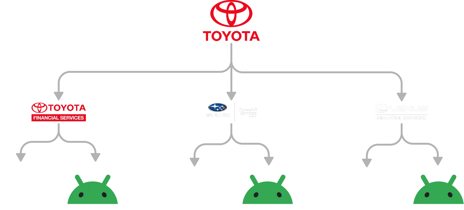
Toyota manages different mobile applications for Toyota Financial Services, Lexus, and Subaru. Although each brand has its own visual identity, all three offer nearly identical flows, structures, and behaviors.
However, this similarity was not reflected in the way the products were designed and developed. Each brand was managed independently and also maintained separate versions for Android and iOS.
The result was a structure made up of three product files in Figma and six code repositories. Every new flow, adjustment, or feature had to be replicated across the three brands and two platforms.
In other words, the same product was built six times so that, in the end, mostly its appearance could change. An effective strategy, assuming the goal was to multiply the workload.

Three brands, two platforms, and the same work repeated
The main problem was not directly related to the user experience. The applications worked, and the goal was not to radically transform their interfaces.
The problem existed behind the product.
Separating the brands and platforms meant that every change had to be designed, developed, and maintained multiple times. This increased operating costs, extended implementation times, and made it more difficult to preserve consistency across the applications.
In design, the same flows were duplicated for Toyota Financial Services, Lexus, and Subaru, along with their respective Android and iOS versions. There was also no shared Design System that could manage their similarities and differences from a centralized source.
Development maintained six independent repositories:
- Toyota Financial Services for Android.
- Toyota Financial Services for iOS.
- Lexus for Android.
- Lexus for iOS.
- Subaru for Android.
- Subaru for iOS.
Although the visual identities were different, the structures and behaviors were exactly the same. A visual difference was therefore being solved through a considerably larger operational difference.
The impact in numbers
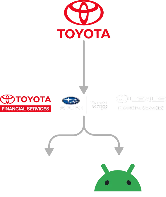
The project consolidated the design and development operations for Toyota Financial Services, Lexus, and Subaru within a shared architecture.
- 3 brands managed through one Design System.
- 6 to 1 manual builds per flow.
- 6 to 1 development repository.
- 6 applications generated from the same codebase.
- 83.3% fewer duplicated design instances.
- 83.3% fewer independent repositories to maintain.
- Approximately 1 month of design and 1 month of development.
The change reduced duplication without significantly altering the existing experience for users.
These figures represent a measurable structural reduction, not necessarily an equivalent decrease in the total amount of time required. Each brand still needs visual and functional validation. What disappeared was the need to build and maintain six independent versions of the same product.
Objectives
- Create a Design System shared by Toyota Financial Services, Lexus, and Subaru.
- Centralize product flows so that each experience only needed to be designed once.
- Build a token architecture capable of representing the visual identity of each brand.
- Align component structures between Figma and development.
- Consolidate the six applications into a single codebase.
- Make it easier to introduce new features and potentially add more brands in the future.
- Keep the transition almost entirely transparent to existing users.
Building one foundation for three identities
The goal was not to visually unify the brands or turn them into slightly recolored versions of the same product.
Toyota Financial Services, Lexus, and Subaru needed to preserve their individual identities. What needed to be unified was the infrastructure used to design and develop them.
The solution was to build a system in which components, rules, and behaviors could be shared, while visual differences were managed through tokens and brand themes.
Confirming that the differences were visual, not structural
The project began with a review of the existing Figma files and the visual guidelines for Toyota Financial Services, Lexus, and Subaru.
Using these materials, I conducted an audit of:
- Components.
- Styles.
- Foundations.
- Visual patterns.
- Navigation structures.
- Behaviors.
- Differences between brands and platforms.
The audit confirmed that all three applications shared the same product architecture. Their flows, components, and behaviors were equivalent. The main differences were found in colors, typography, logos, shapes, and other elements of brand identity.
Separating product logic from brand identity
The project’s main decision was to use a Headless Design System methodology.
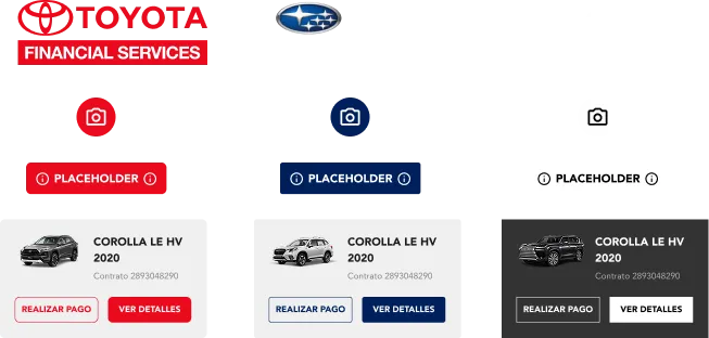
Instead of building a separate library for each brand, the structural logic was separated from its visual representation. Components, properties, and behaviors would form a shared core, while the identities of Toyota Financial Services, Lexus, and Subaru would be applied through tokens and themes.
The system was organized around two layers:
- A shared foundation, responsible for component structure, behavior, and rules.
- A theming layer, responsible for representing each brand’s visual identity.
This architecture allowed the same component to adopt different typography, colors, shapes, and dimensions without changing its structure or creating brand-specific copies.
Every component could be used across Toyota Financial Services, Lexus, and Subaru. There was no need to maintain parallel libraries or exclusive versions for each brand.
The system was also designed to support future scenarios. If Toyota needed to add another brand, it could be connected to the shared core through a new token configuration instead of starting another system from scratch. A tradition that did not need to be preserved.
Creating a shared token architecture
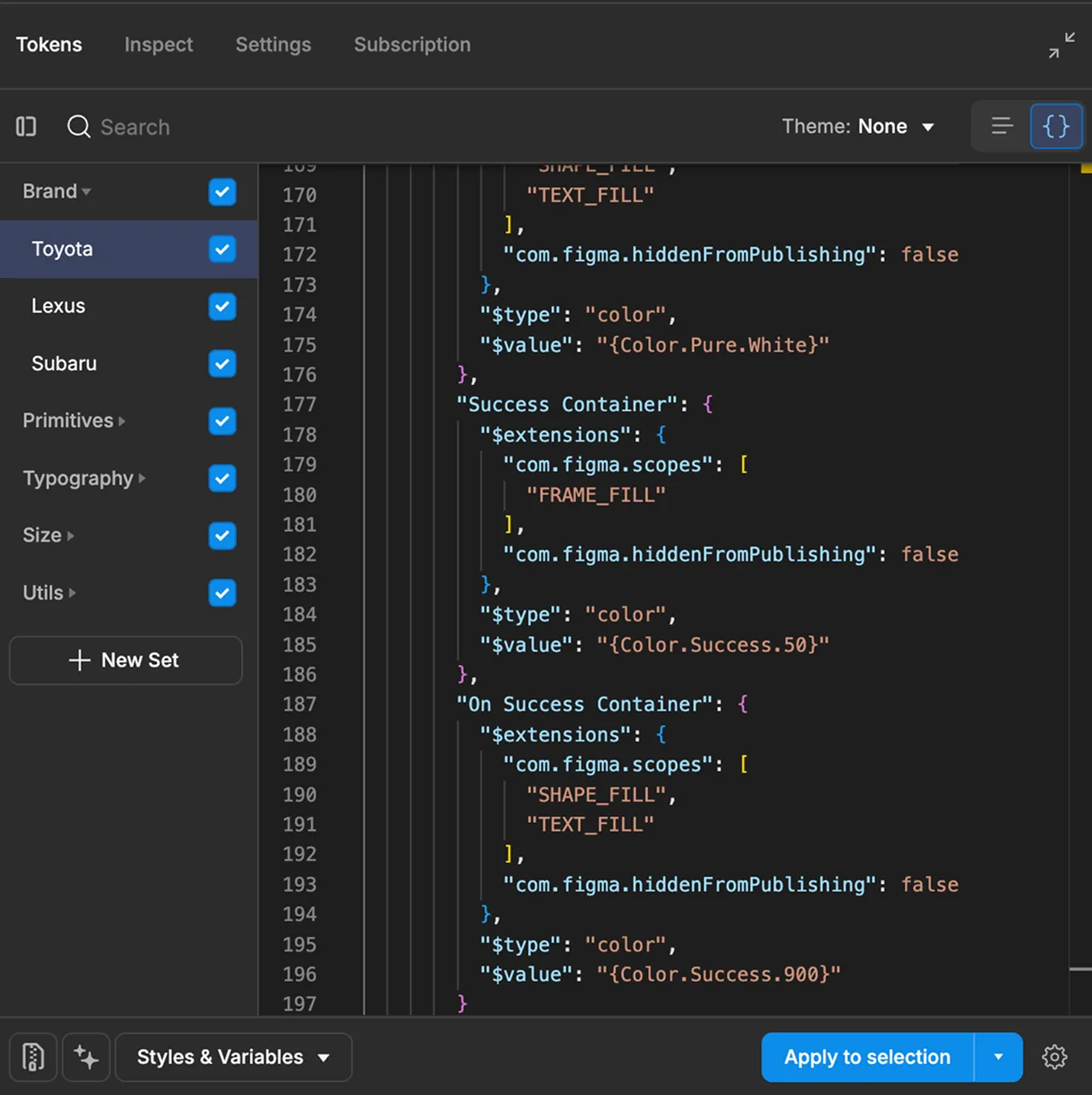
Once the general architecture had been defined, the visual foundations required to represent the three brands were organized into a two-level token structure.
Primitive tokens
Primitive tokens contained the raw values used throughout the system, including:
- Colors
- Typography values
- Spacing
- Sizing
- Corner radius
- Shadows
At this level, the tokens did not yet represent a specific use within the interface or belong to a particular brand.
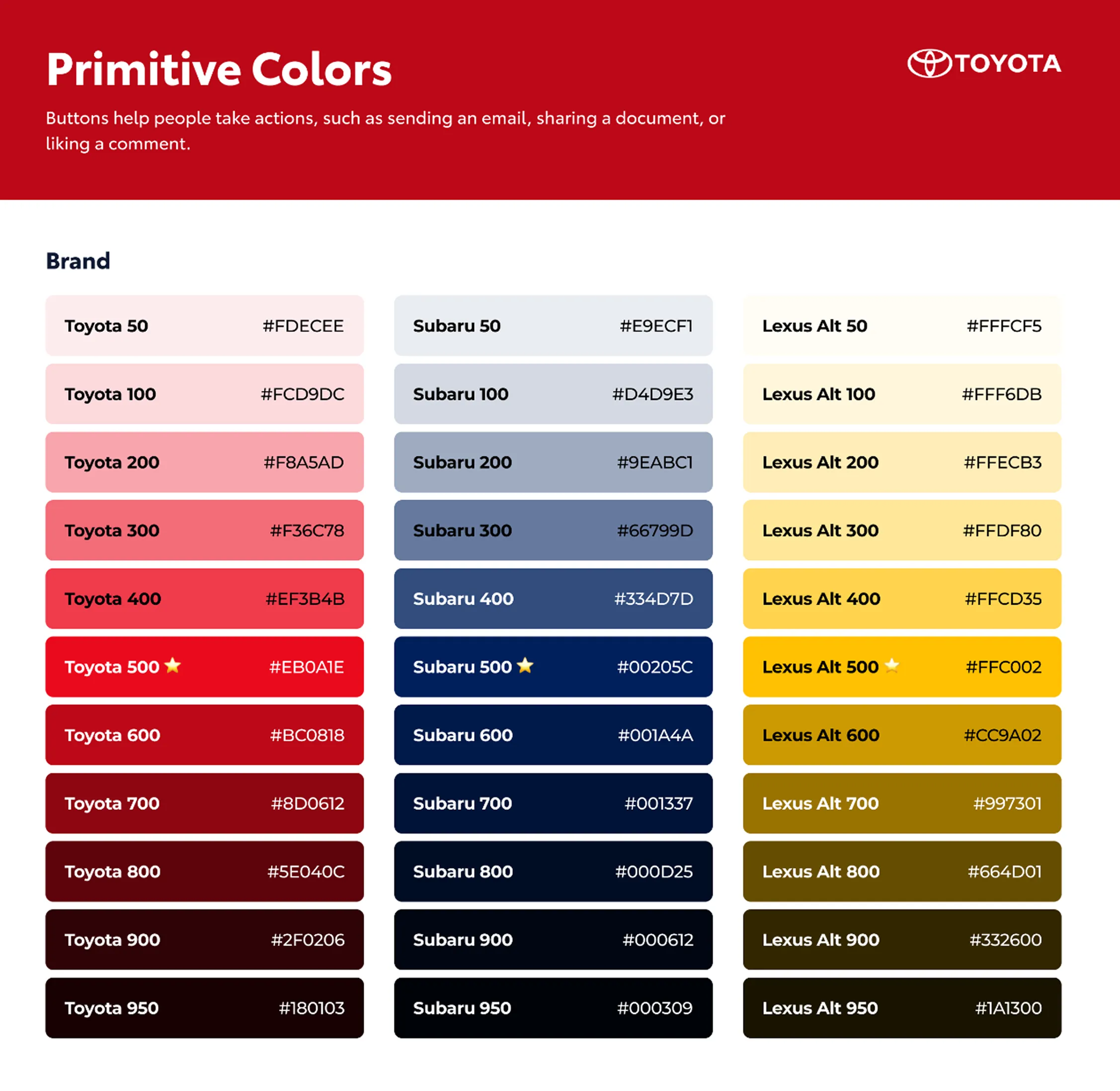
Brand tokens
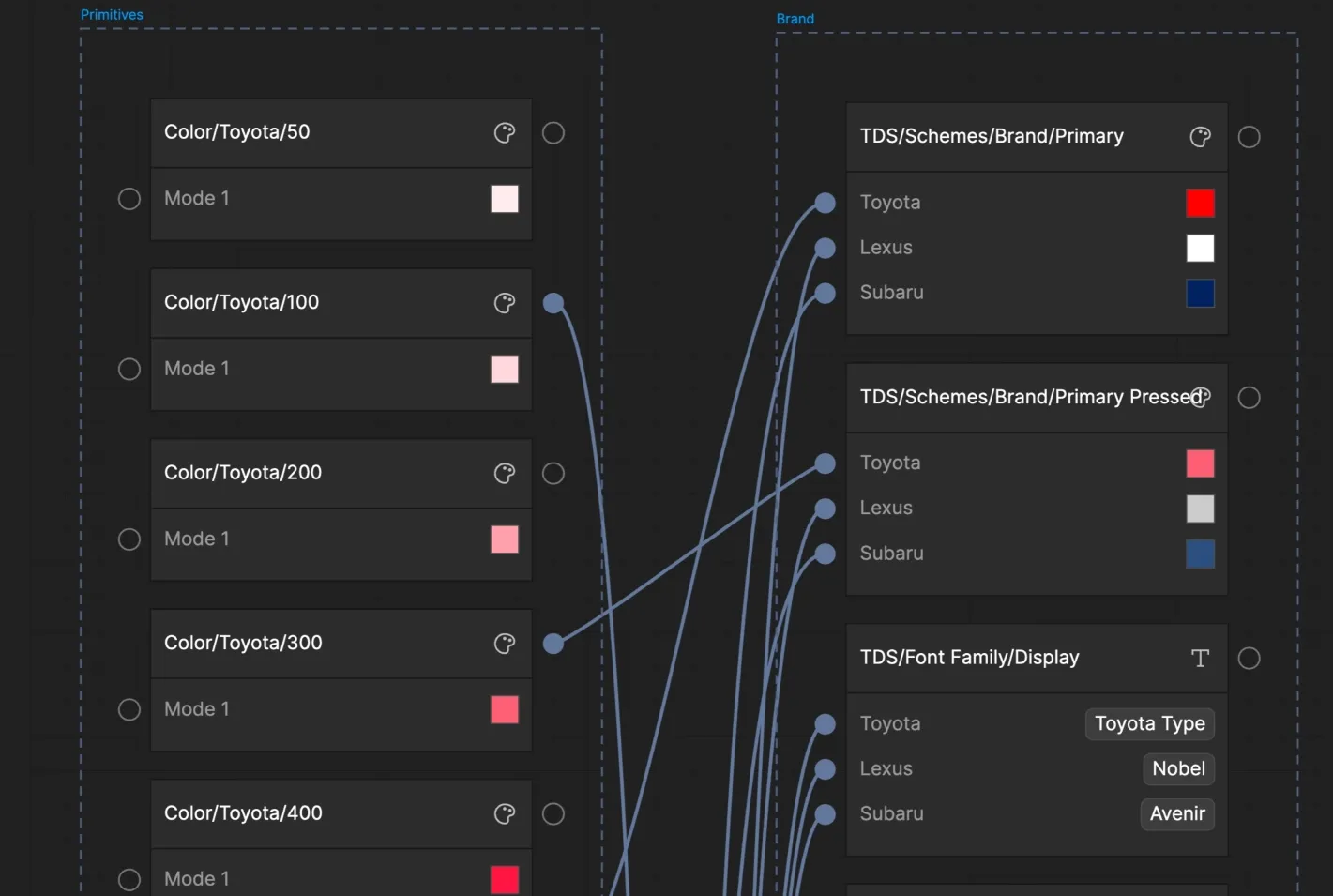
Brand tokens acted as the semantic layer of the system. These tokens connected the primitive values to a specific purpose and adapted that purpose to the visual identity of Toyota Financial Services, Lexus, or Subaru.
They defined properties such as:
- Primary and secondary colors
- Text and surface colors
- Typography
- Spacing
- Component sizing
- Corner radius
- Shadows
- Interface states
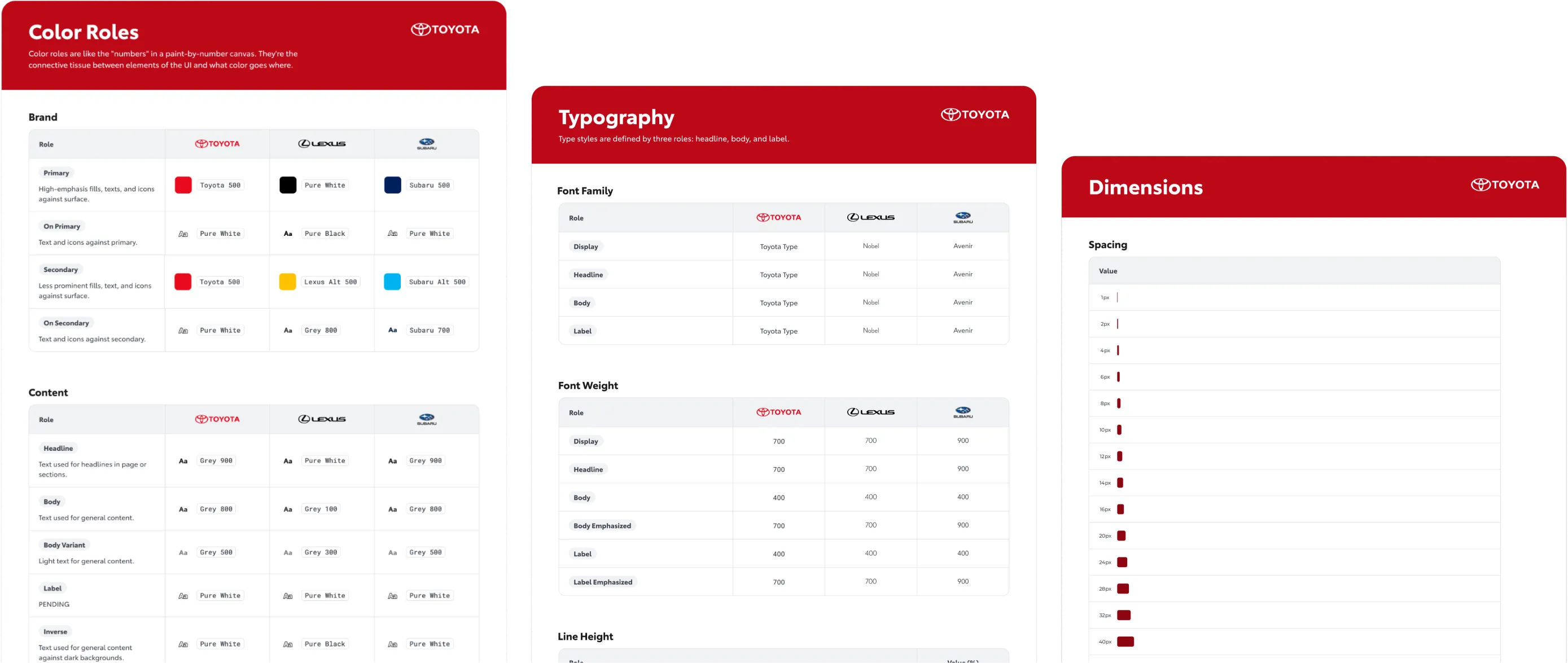
This allowed the same component structure to use different visual values depending on the active brand.
For example, Lexus could use sharper corners and a darker visual language, while Toyota Financial Services and Subaru could apply different typography, colors, and shape treatments without requiring separate components.
The system did not need an additional component-token layer. The brand tokens contained the necessary visual decisions for each identity and connected them directly to the shared component architecture.
The difference needed to live in the brand configuration, not in three nearly identical components waiting to be maintained separately.
Rethinking Lexus’s UI
Tokenization exposed several inconsistencies inherited from the previous applications.
In some cases, colors were used simply to create differentiation between brands, even when there was no semantic reason to do so. This created exceptions that were difficult to integrate into a shared architecture.
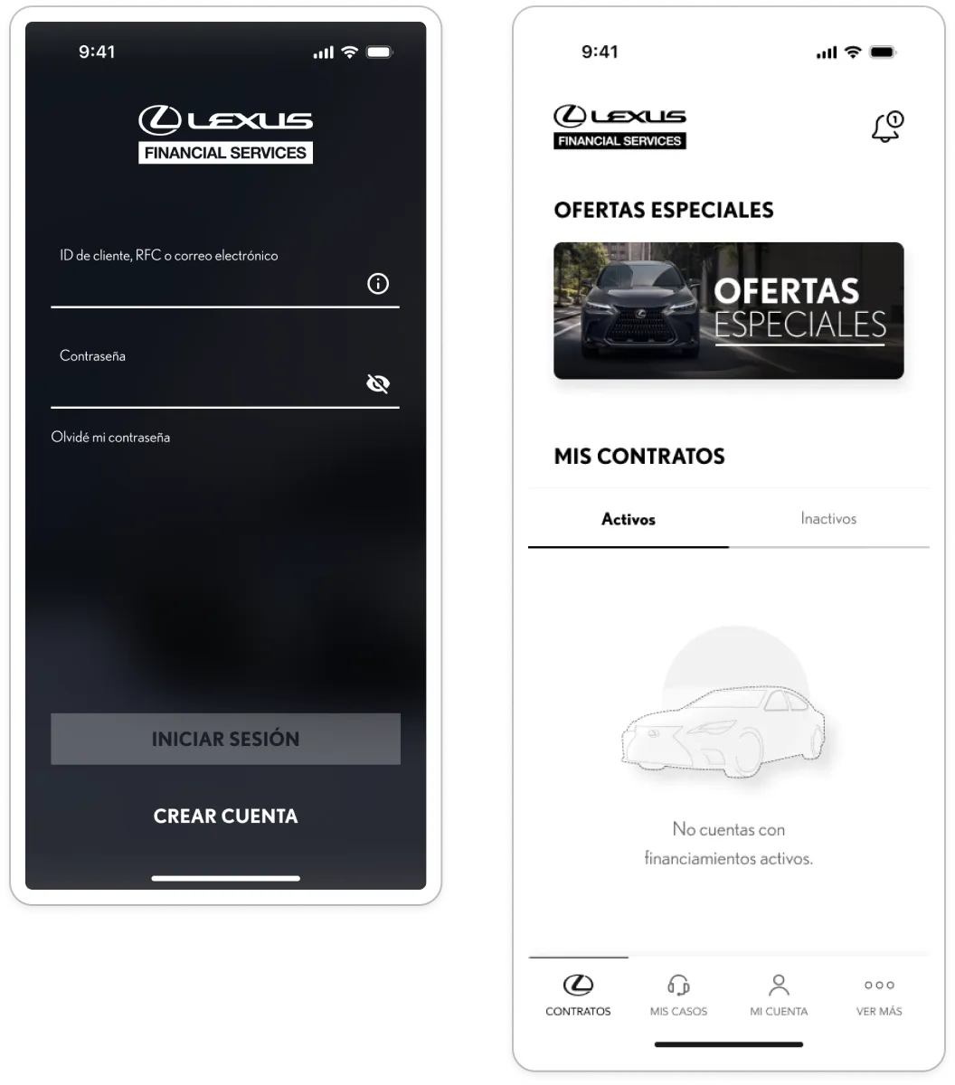
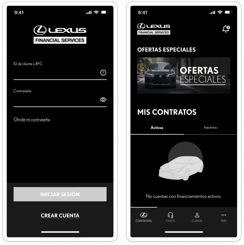
The clearest example was Lexus. Its interface combined decisions associated with both light and dark themes, making it difficult to assign consistent functions to its colors.
To address this, its color system was restructured and the experience was defined as fully dark.
Lexus also needed to project a more refined and premium identity. Its components therefore used straight shapes with almost no rounded corners, while Toyota Financial Services and Subaru could preserve different visual expressions.
The goal was not to make all three brands look the same. It was to ensure that their differences were organized, scalable, and based on something more meaningful than “this is how it has always been done.”
Rebuilding components with code in mind
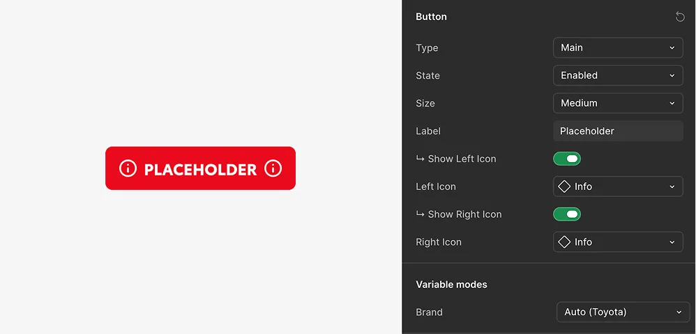
Although components already existed in the previous Figma files, the decision was made to rebuild them from scratch.
The previous elements had been created exclusively for use in design. Their variants, properties, and structures could therefore follow practical Figma decisions without necessarily having a clear equivalent in code.
The new system needed to connect directly with development, so component construction considered the following from the beginning:
- Consistent naming.
- Equivalent properties.
- Defined states.
- Reusable structures.
- A clear relationship between Figma variants and code properties.
- Proper token usage.
- Compatibility with the themes of all three brands.
All components were shared. No brand-specific versions were created for Toyota Financial Services, Lexus, or Subaru.
Native visual differences between Android and iOS were not preserved either. Both platforms used the same patterns and visual expression, avoiding another layer of duplication within the system.
Connecting Figma and development from the start
The Design System was not conceived solely as a visual library. Its construction accounted for how it would be consumed by the development team from the beginning.
The following tools and resources were used:
- Figma variables.
- Figma Model Context Protocol.
- Tokens Studio.
- Construction guidelines.
- A shared repository.
- Claude-powered automations.
Tokens Studio made it possible to export and maintain tokens between Figma and development. This reduced the need for manual interpretation and helped preserve the same references across both environments.
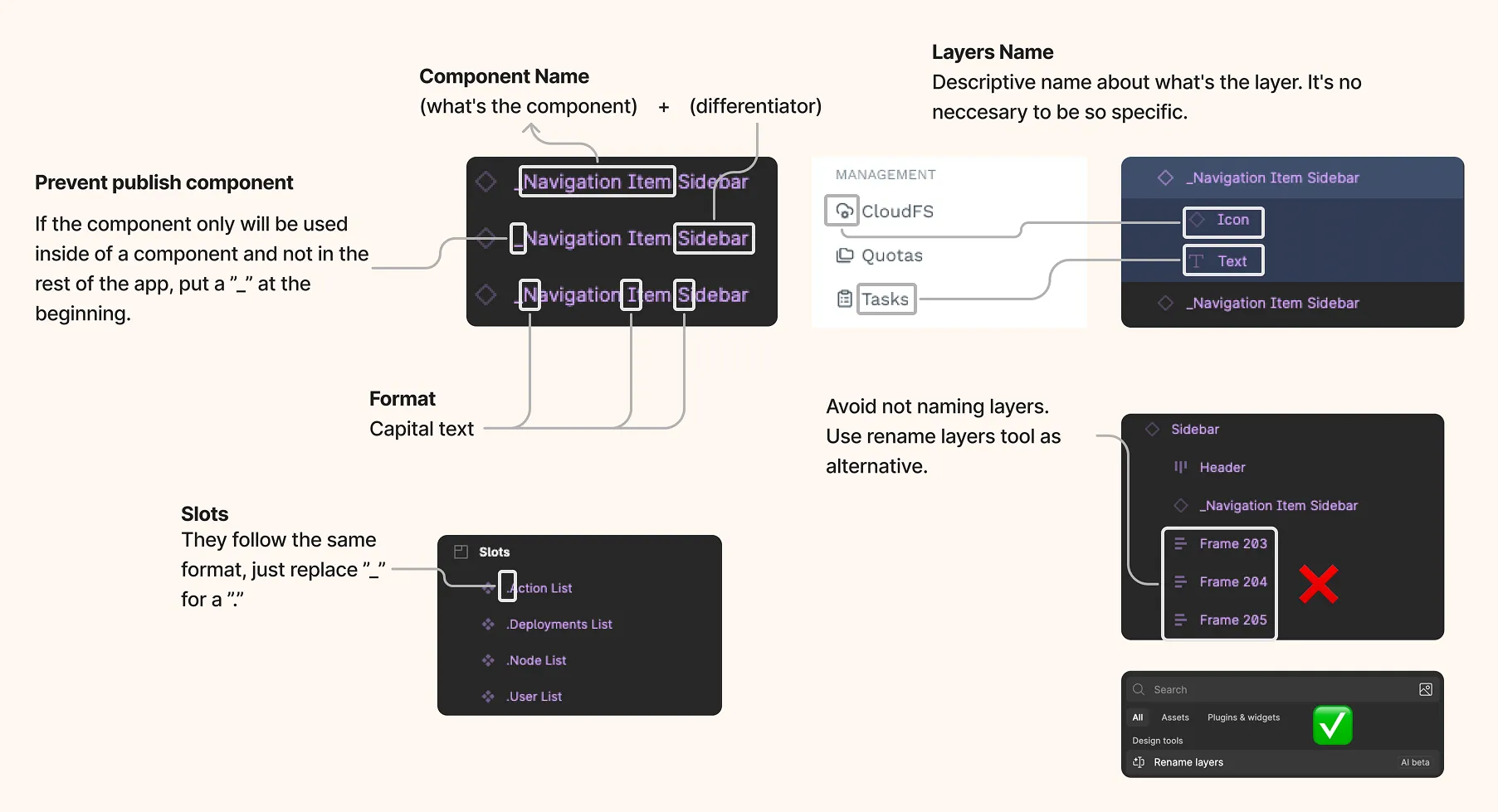
Documentation was created within Figma and included rules for:
- Component construction.
- Naming conventions.
- Properties.
- Token usage.
- Variant organization.
- Expected behaviors.
Development guidelines were defined in parallel. These explained how elements should be built from scratch in order to maintain consistency with the Design System.
Automating consistency with a Claude Skill
To validate that design and development remained aligned, the team created a Claude Skill based on the guidelines defined for both environments.
The skill used these rules to review aspects such as:
- Element naming.
- Token naming.
- Use of the same references in Figma and code.
- Alignment between documented and implemented tokens.
- Compliance with general construction criteria.
- Potential inconsistencies between design and development.
This added an automated quality assurance layer to the process.
Instead of relying exclusively on manual reviews of layers, names, properties, and references, an activity that remains fascinating for approximately four minutes, the team could identify deviations more quickly.
The Claude Skill did not replace human review, but it helped detect inconsistencies before they spread across the different applications.
Designing every flow once
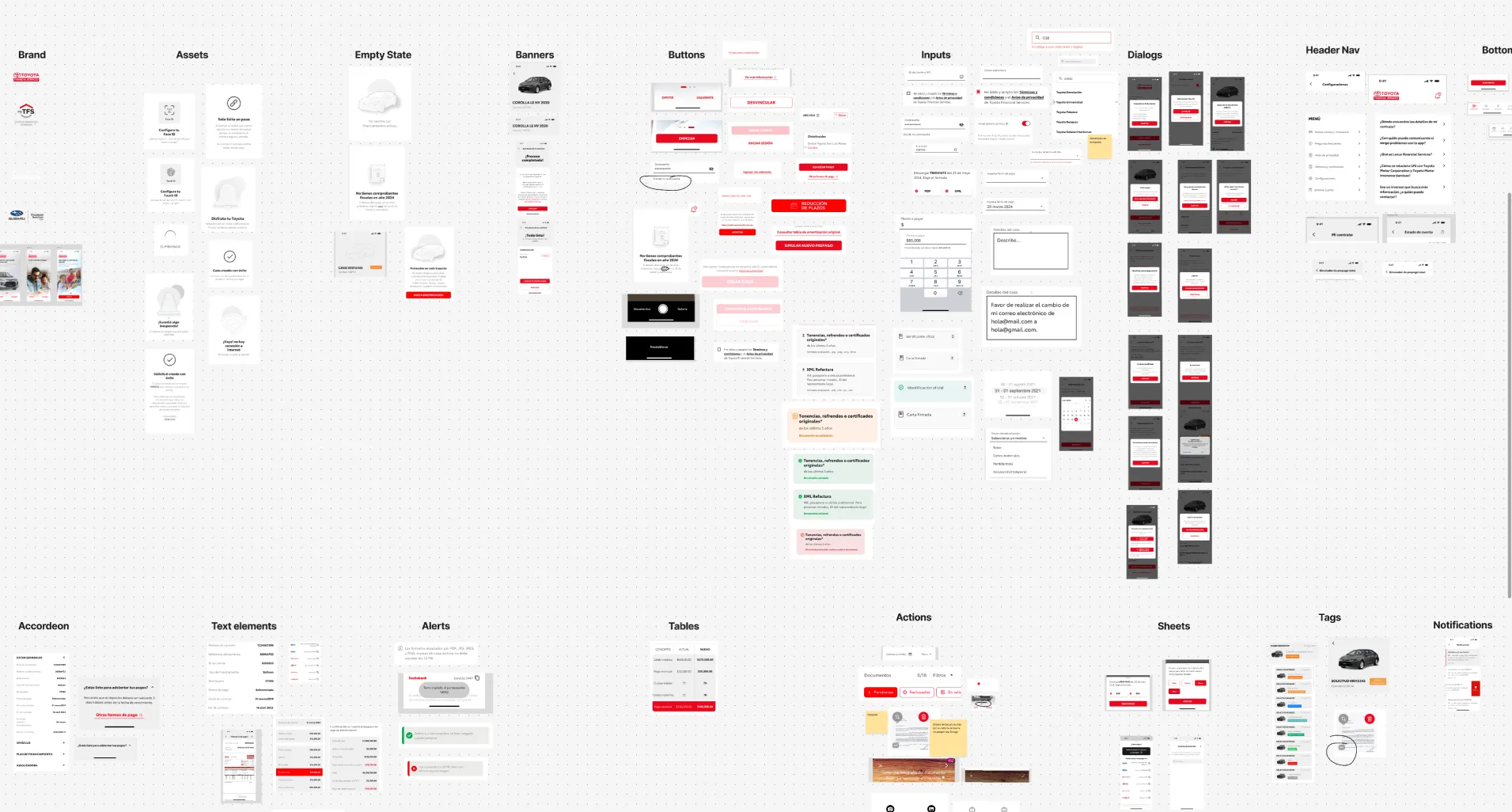
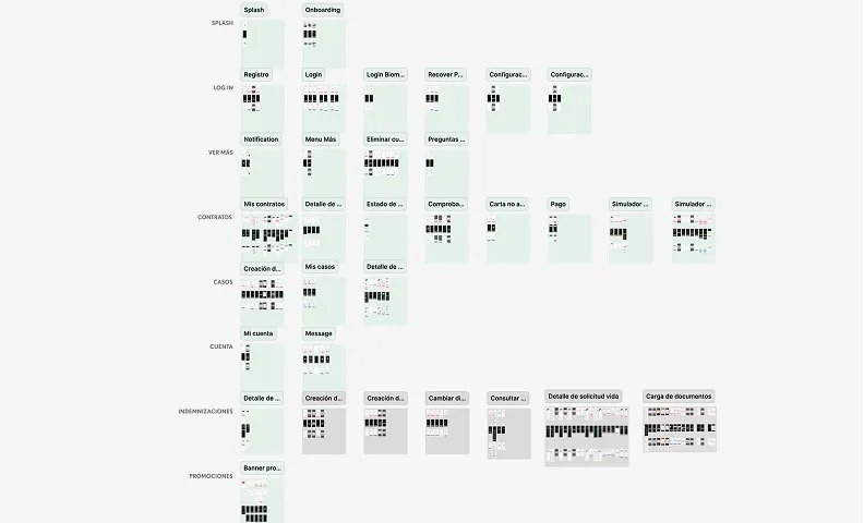
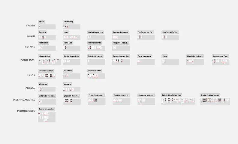
In addition to the Design System file, a central file containing all application flows was created.
Previously, each flow could be represented up to six times:
- Three brands.
- Two platforms.
With the new structure, each flow was designed once, and its appearance could be adapted to Toyota Financial Services, Lexus, or Subaru through the theming system.
The model moved from multiple brand-specific files to two centralized sources:
- One file for the Design System.
- One file for product flows.
The main improvement was not simply reducing the number of files. It was eliminating duplication within them and establishing a shared source of truth.
During the project, I worked with two developers who specialized in hybrid applications. Decisions related to architecture, naming, tokenization, and properties were made with their implementation and long-term maintenance in mind.
Collaboration was not limited to handing off finished components. The goal was for Figma and code to share the same logic, not simply look similar enough to pass a visual review.
Results
The Design System was implemented, and the resulting applications were published in the digital stores for Toyota Financial Services, Lexus, and Subaru.
The transition was intentionally difficult for users to notice. The goal was not to force them to learn a new experience, but to replace the underlying design and development infrastructure without disrupting their usual tasks.
In this case, the fact that the change went almost unnoticed was part of the intended result.
From six independent versions to one shared foundation
Previously, each flow had to be designed for three brands and two platforms, while development maintained six independent repositories.
With the new system, each flow is designed once, and all six applications are generated from the same codebase.
The improvement went beyond reducing the number of files or repositories. It also changed how updates were managed.
A component structure could be updated from a shared source. A new feature could be designed once. A correction could be implemented in the same repository and distributed to the relevant applications.
The three brands preserved their identities, but they no longer required independent products to express them.
Instead of designing and correcting the same behavior six times while hoping for consistent results, the team could manage a single shared source.
An invisible change for users, but not for operations
The project delivered:
- One Design System for three brands.
- One central product flow file.
- A shared component architecture.
- Three visual themes managed through tokens.
- Aligned guidelines for Figma and development.
- A Claude Skill supporting quality assurance.
- One repository capable of generating six applications.
Although there are no post-launch financial or productivity metrics available, the structural changes are measurable.
Duplication was reduced, maintenance was centralized, and a foundation was created that is prepared to scale. The implementation of new features was also simplified because design and development no longer depended on six independent versions.
For users, the experience remained stable. For operations, the way it was built changed completely.
Conclusion
The main value of the Toyota Design System does not lie in the number of components created, but in the architecture connecting them.
The project preserved the individual identities of Toyota Financial Services, Lexus, and Subaru without maintaining three separate systems. It also aligned design and development through tokens, shared rules, and automated validation.
The result was an infrastructure capable of managing three brands and two platforms from the same foundation, simplifying maintenance and the introduction of new features.
For users, the applications continued to work as before. For the teams responsible for maintaining them, they stopped being six independent products disguised as one.